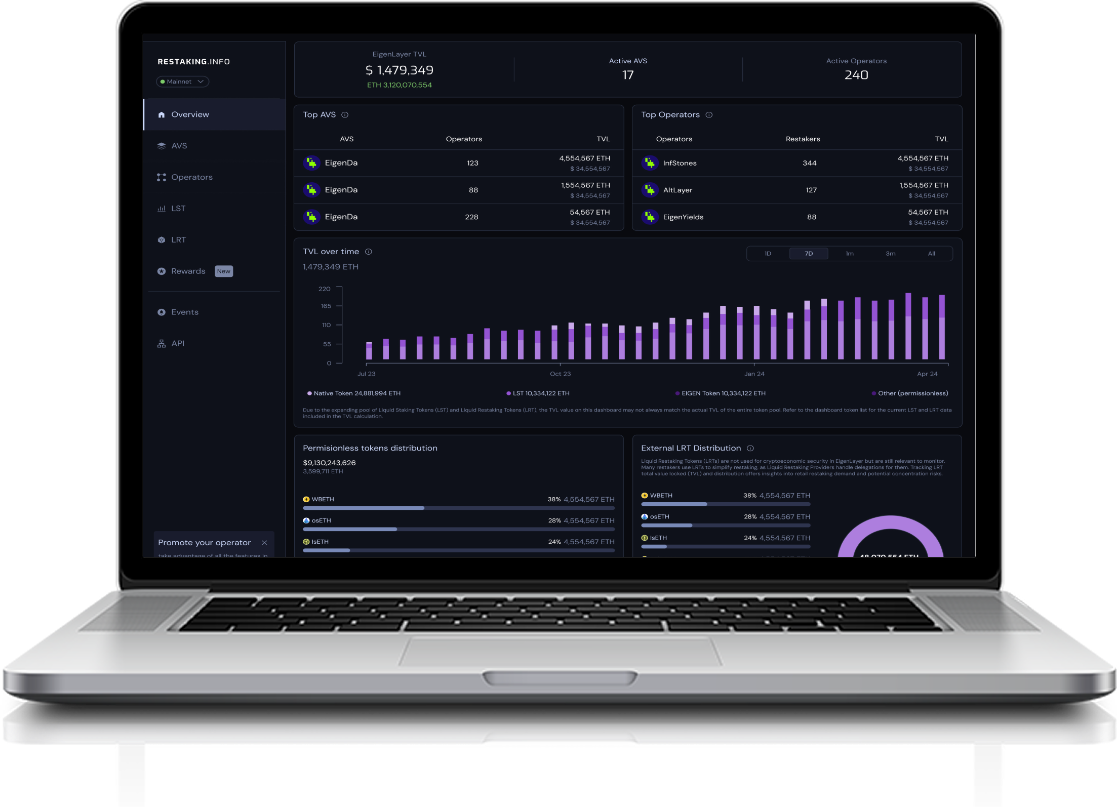
| AVS | Operators | TVL |
|---|---|---|
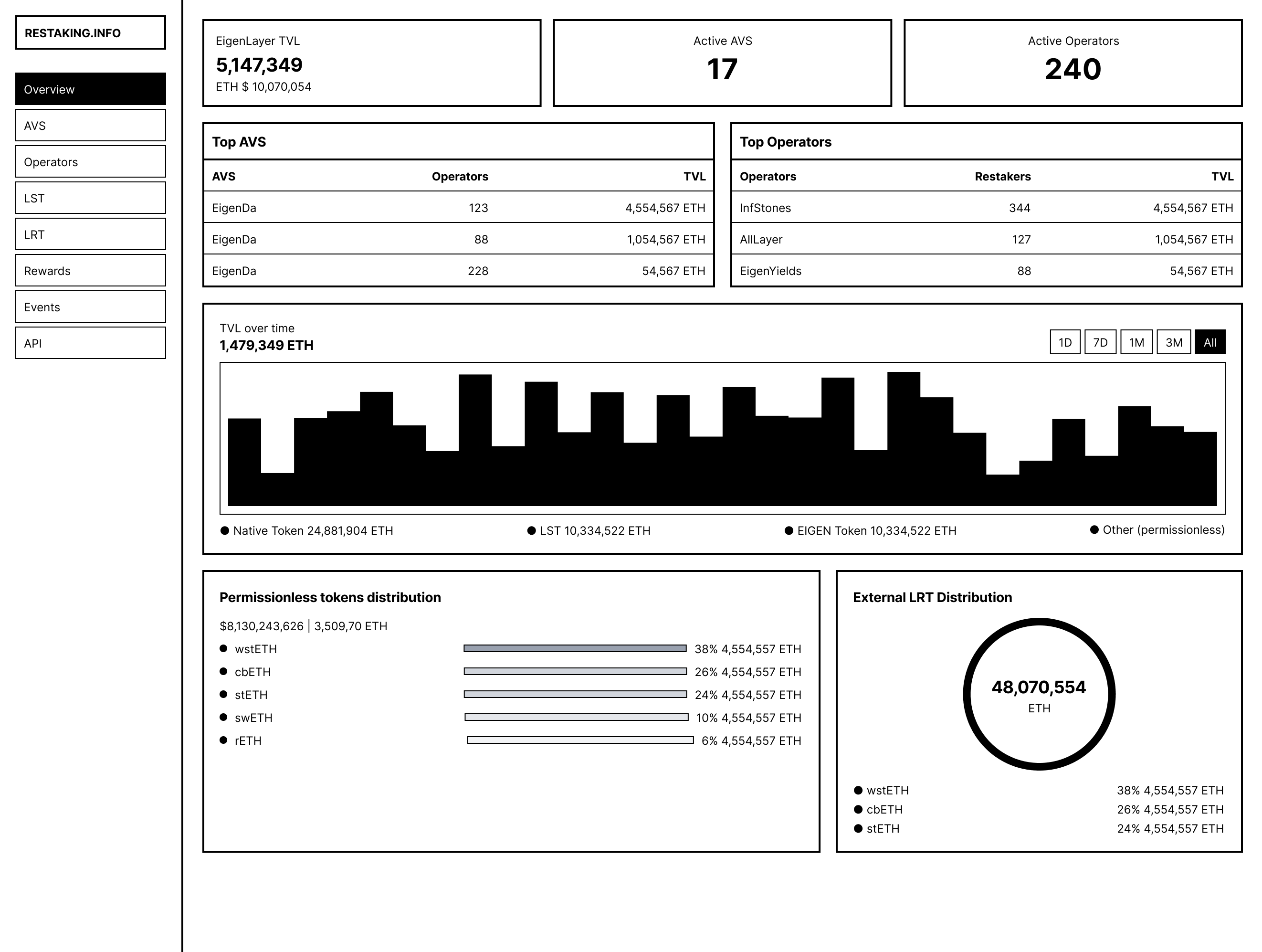
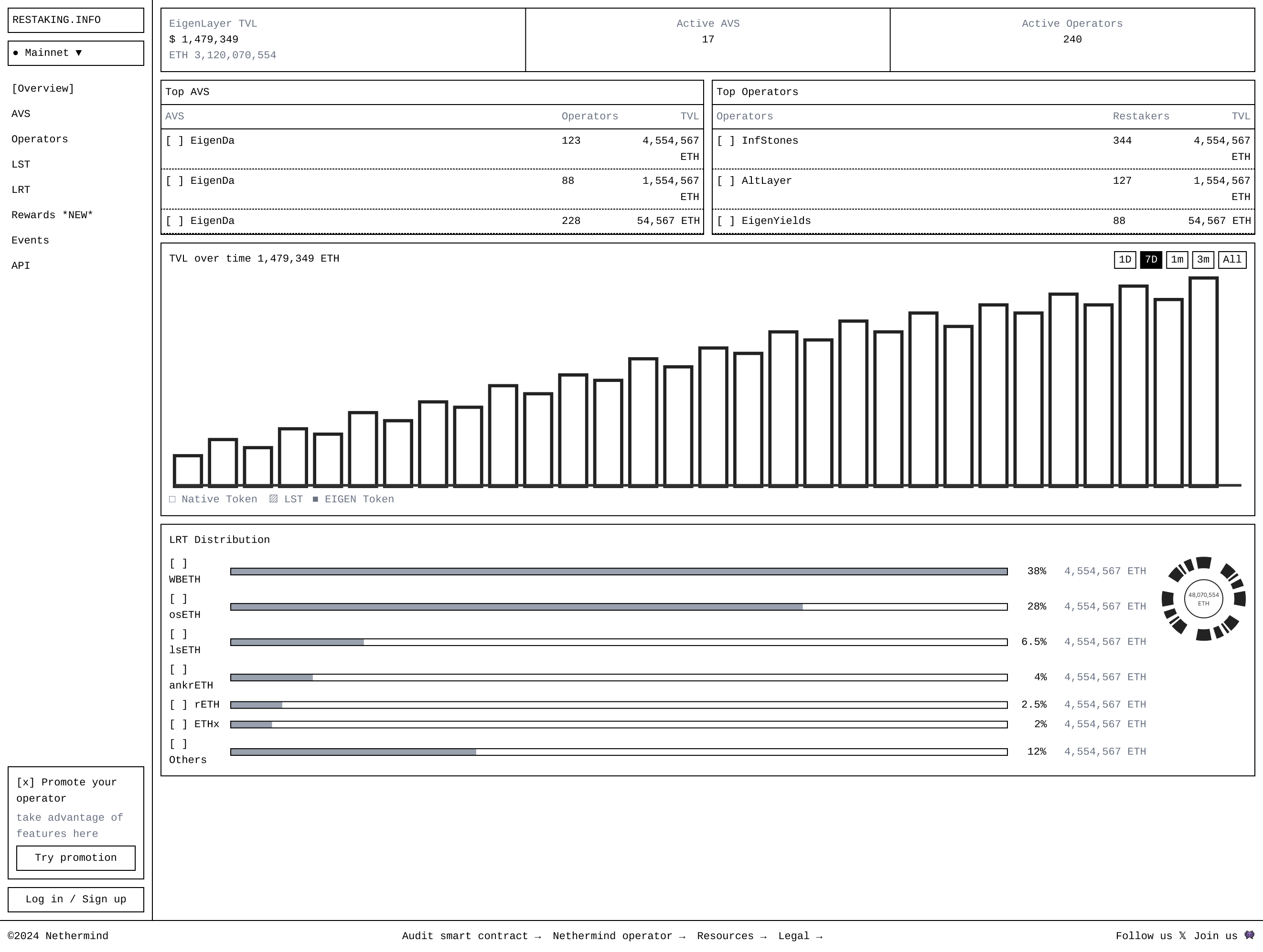
E EigenDa |
123 | 4,554,567 ETH$ 34,554,567 |
E EigenDa |
88 | 1,554,567 ETH$ 34,554,567 |
E EigenDa |
228 | 54,567 ETH$ 34,554,567 |
| Operators | Restakers | TVL |
|---|---|---|
I InfStones |
344 | 4,554,567 ETH$ 34,554,567 |
A AltLayer |
127 | 1,554,567 ETH$ 34,554,567 |
Y EigenYields |
88 | 54,567 ETH$ 34,554,567 |
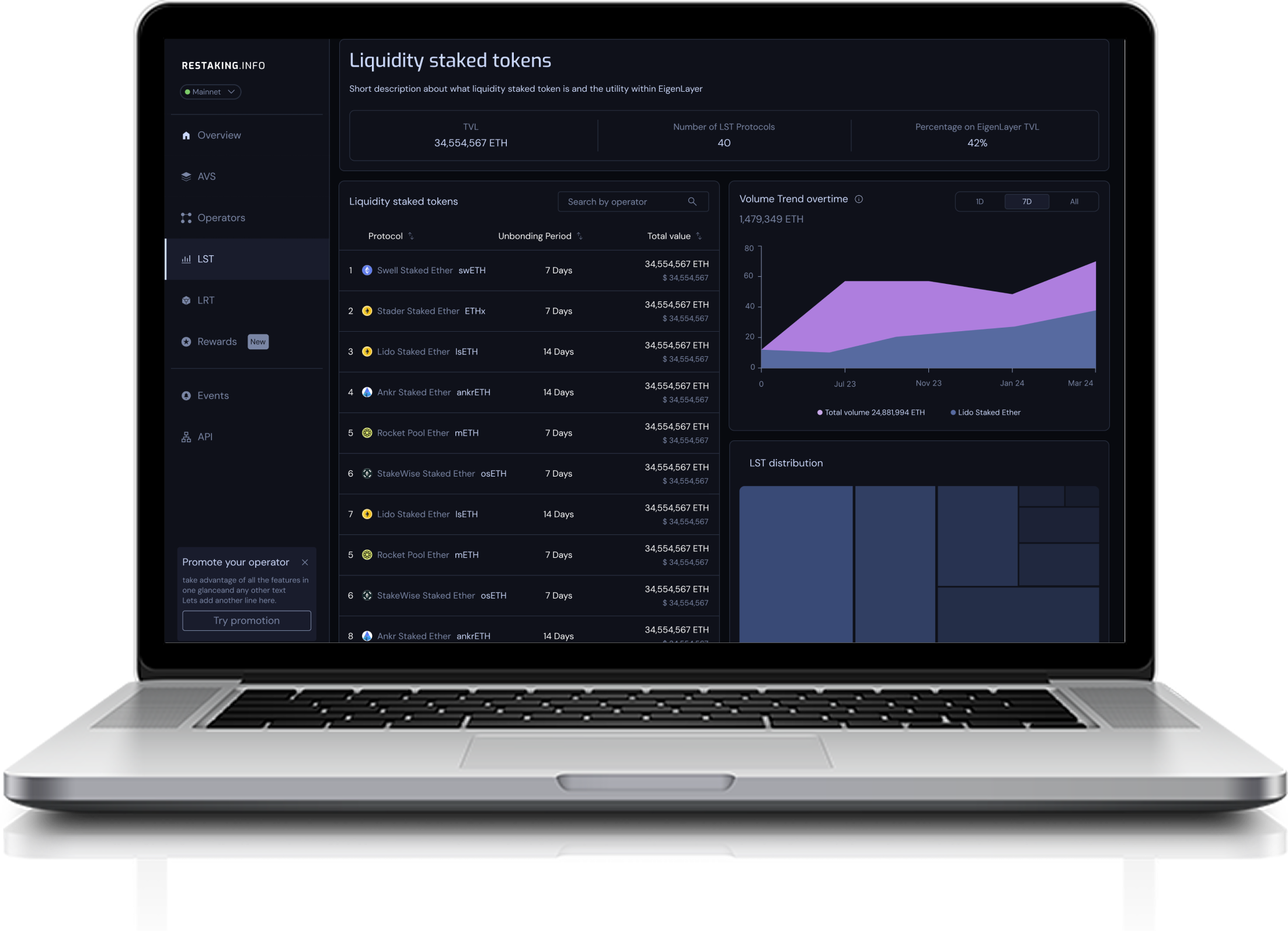
Due to the expanding pool of Liquid Staking Tokens (LST) and Liquid Restaking Tokens (LRT), the TVL value on this dashboard may not always match the actual TVL of the entire token pool. Refer to the dashboard token list for the current LST and LRT data included in the TVL calculation.
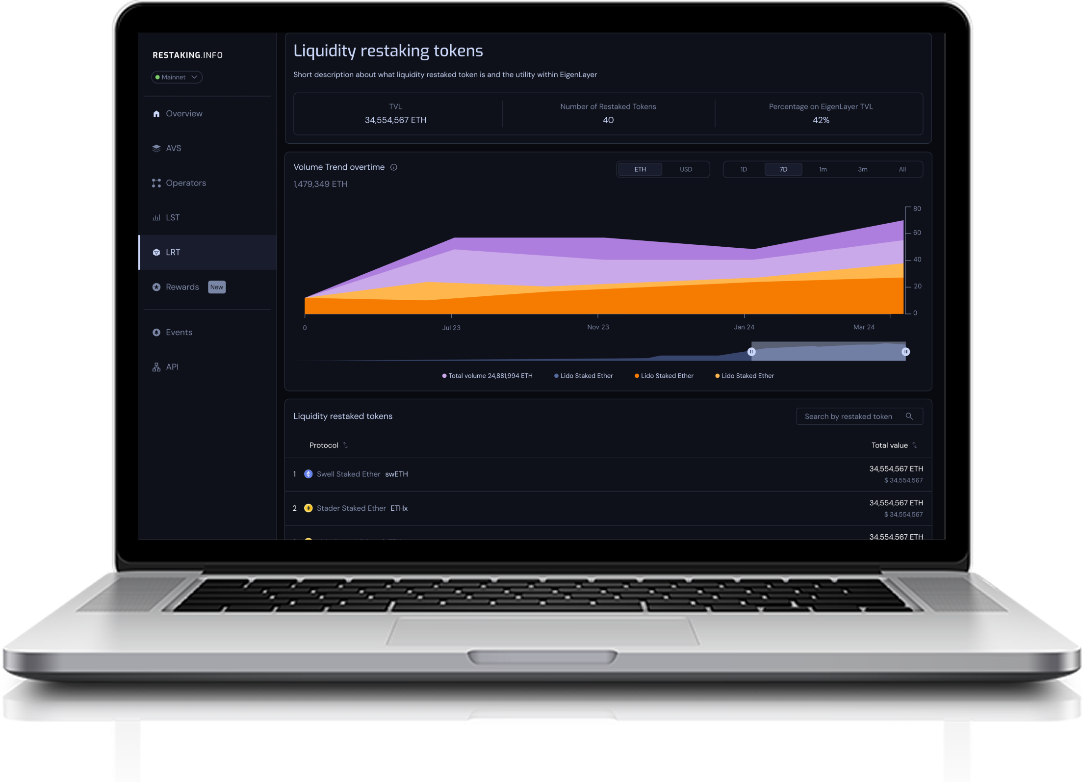
Liquid Restaking Tokens (LRTs) are not used for cryptoeconomic security in EigenLayer but are still relevant to monitor. Many restakers use LRTs to simplify restaking, as Liquid Restaking Providers handle delegations for them. Tracking LRT total value locked (TVL) and distribution offers insights into retail restaking demand and potential concentration risks.
| # | AVS | Operators | Restakers | TVL |
|---|---|---|---|---|
| 1 | E EigenDA | 123 | 21,345 | 4,554,567 ETH$ 34,554,567 |
| 2 | A AltLayer | 88 | 18,902 | 1,554,567 ETH$ 28,120,000 |
| 3 | Y EigenYields | 228 | 14,210 | 54,567 ETH$ 12,900,000 |
| 4 | L Lagrange | 64 | 9,822 | 820,000 ETH$ 8,200,000 |
| 5 | W WitnessChain | 41 | 7,100 | 540,000 ETH$ 5,400,000 |
| 6 | H Hyperlane | 37 | 5,930 | 320,000 ETH$ 3,200,000 |
| 7 | O Omni Network | 29 | 4,670 | 210,000 ETH$ 2,100,000 |
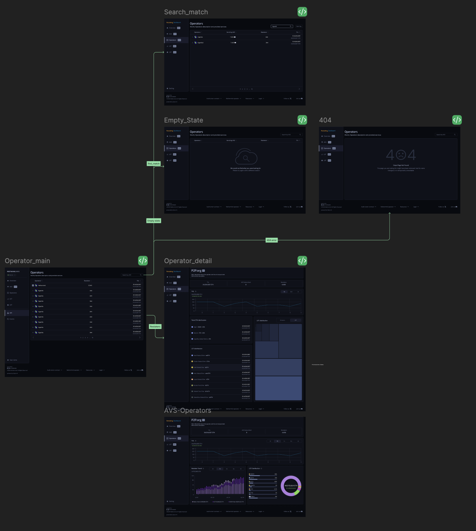
| # | Operator | AVS | Restakers | TVL |
|---|---|---|---|---|
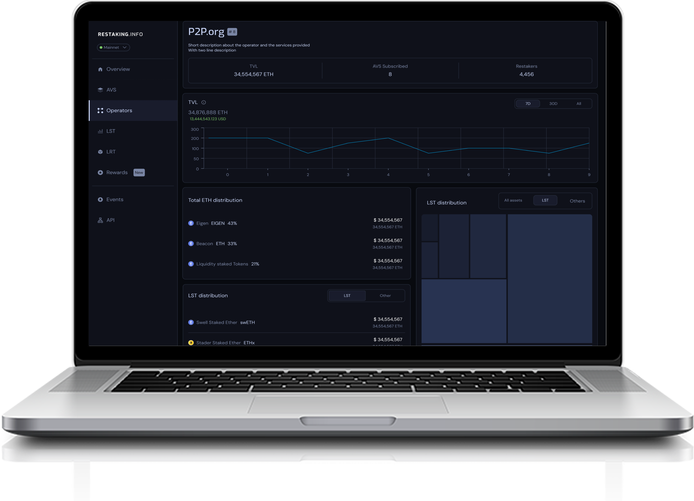
| 1 | N Nethermind | 7 AVS | 344 | 4,554,567 ETH$ 34,554,567 |
| 2 | I InfStones | 5 AVS | 288 | 2,120,000 ETH$ 21,200,000 |
| 3 | A AltLayer | 4 AVS | 127 | 1,554,567 ETH$ 15,500,000 |
| 4 | P P2P.org | 6 AVS | 198 | 980,000 ETH$ 9,800,000 |
| 5 | B Blockdaemon | 3 AVS | 142 | 760,000 ETH$ 7,600,000 |
| 6 | H HashKey Cloud | 2 AVS | 89 | 420,000 ETH$ 4,200,000 |
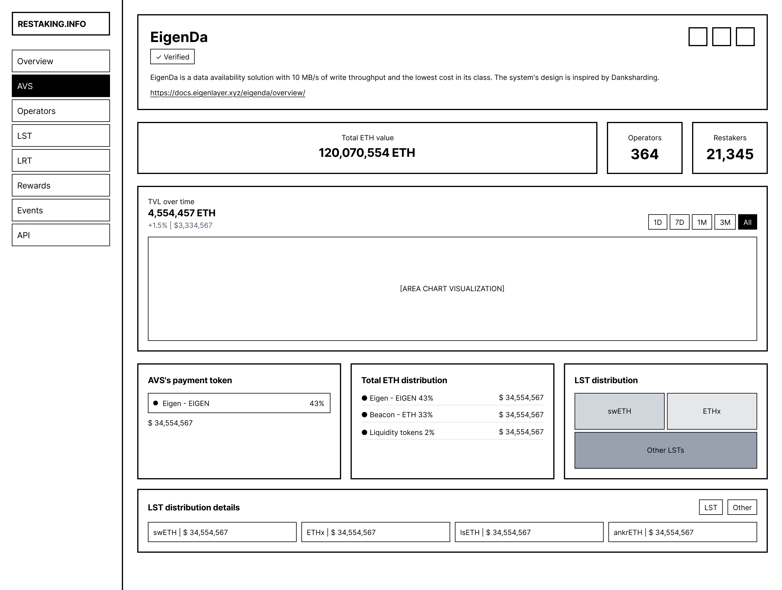
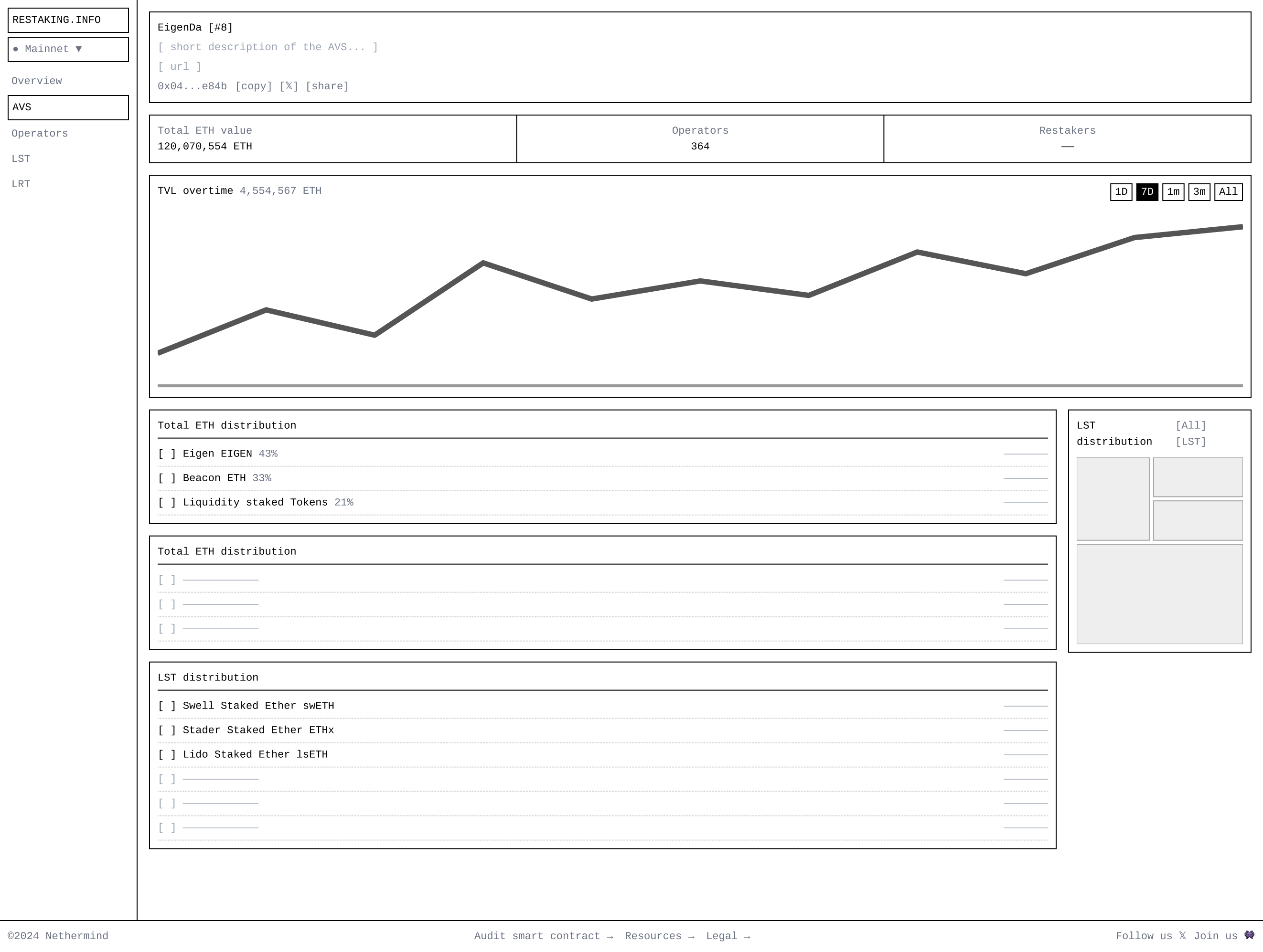
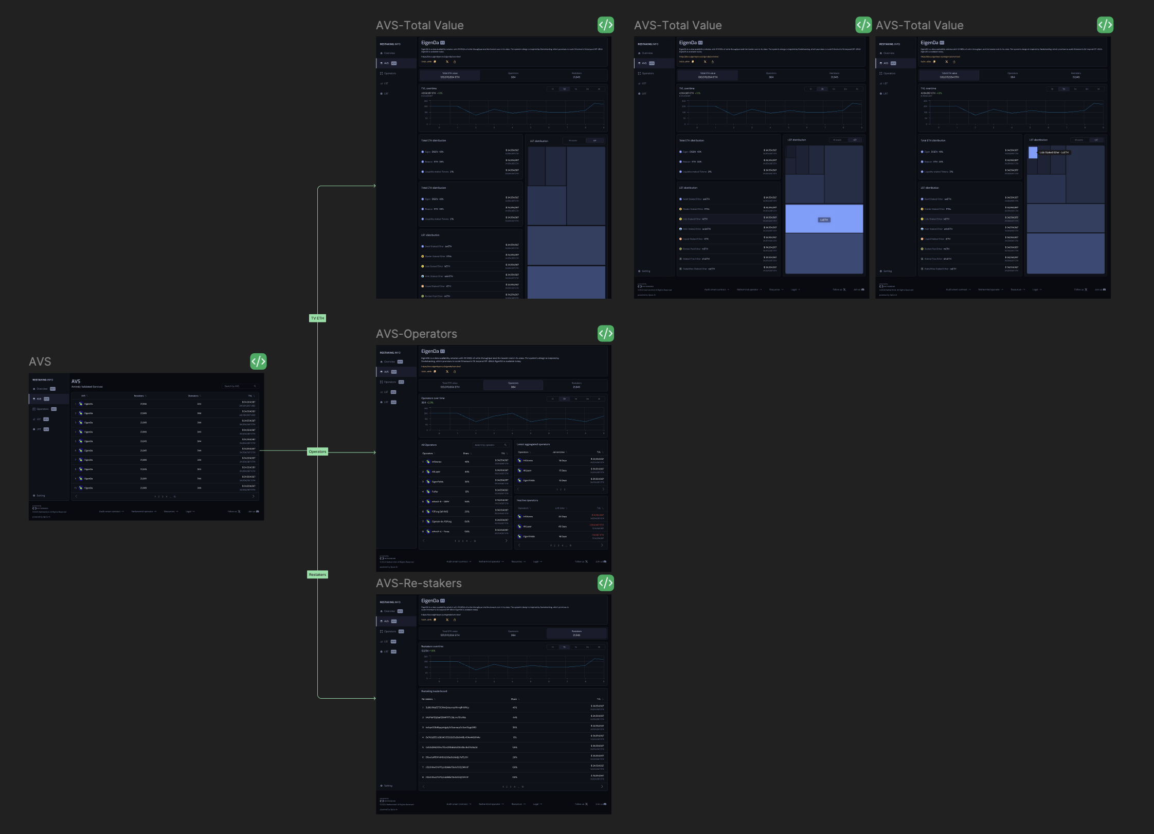
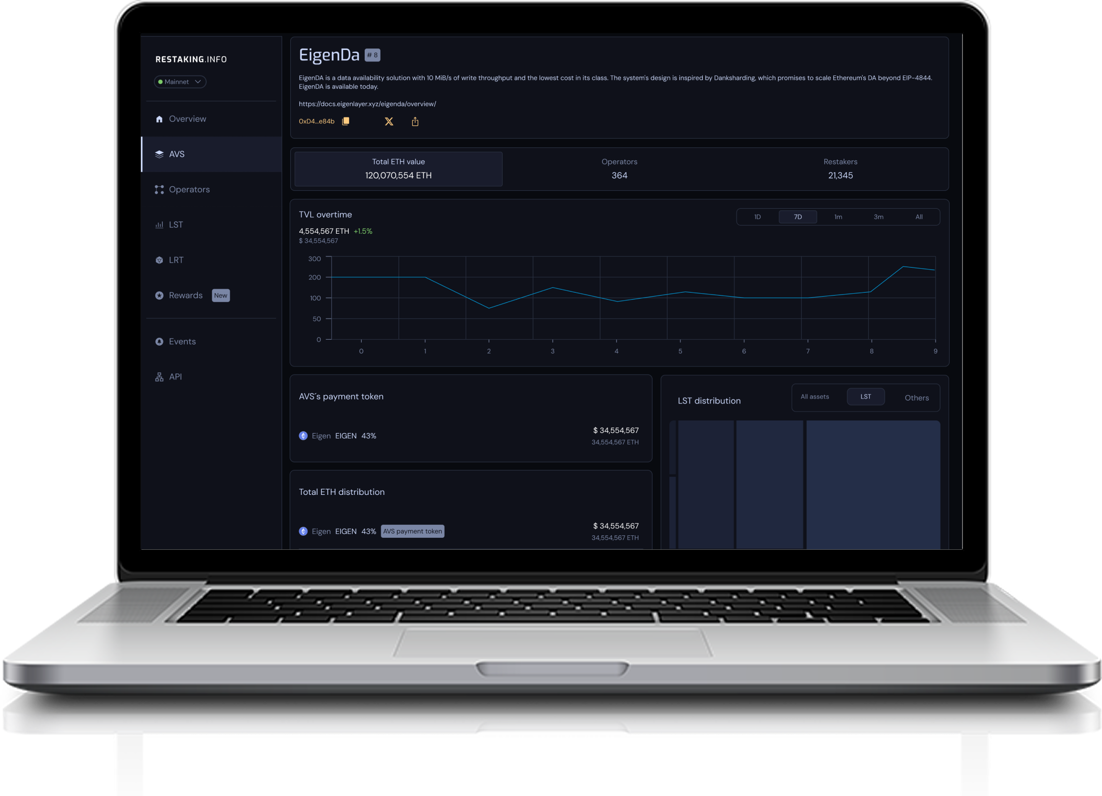
EigenDA is a data availability solution with 10 MiB/s of write throughput and the lowest cost in its class. The system's design is inspired by Danksharding, which promises to scale Ethereum's DA beyond EIP-4844. EigenDA is available today.
https://docs.eigenlayer.xyz/eigenda/overview/| # | Operators ↓ | Share ↓ | TVL ↓ |
|---|---|---|---|
| 1 | I InfStones | 46% | $ 34,554,56734,554,567 ETH |
| 2 | A AltLayer | 44% | $ 34,554,56734,554,567 ETH |
| 3 | E EigenYields | 36% | $ 34,554,56734,554,567 ETH |
| 4 | P Puffer | 12% | $ 34,554,56734,554,567 ETH |
| Operators ↓ | Joined time ↓ | TVL ↓ |
|---|---|---|
I InfStones | 15 Days | $ 34,554,56734,554,567 ETH |
A AltLayer | 15 Days | $ 34,554,56734,554,567 ETH |
E EigenYields | 15 Days | $ 34,554,56734,554,567 ETH |
| # | Re-stakers ↓ | Share ↓ | TVL ↓ |
|---|---|---|---|
| 1 | 3J98t1WpEZ73CNmQviecrnyiWrnqRhWNLy | 46% | $ 34,554,56734,554,567 ETH |
| 2 | 1A1zP1eP5QGefi2DMPTfTL5SLmv7DivfNa | 44% | $ 34,554,56734,554,567 ETH |
| 3 | bc1qw508d6qejxtdg4y5r3zarvaryOc5xw7kygt08O | 36% | $ 34,554,56734,554,567 ETH |
| 4 | 0x742d35Cc6634C0532925a3b844Bc454e4438f44e | 12% | $ 34,554,56734,554,567 ETH |
| 5 | 0x53d284357ec7Oce289d6d64134dfac8e511c8a3d | 5.6% | $ 34,554,56734,554,567 ETH |
| 6 | D5ocSs1RE4YxMGJQ3Ge9tUtbSjLPxFEz5H | 2.6% | $ 34,554,56734,554,567 ETH |
| 7 | t1ZcErWwD1YrP2yL6bNKeT6eXs7z5jCMVVF | 0.6% | $ 34,554,56734,554,567 ETH |
| 8 | t1ZcErWwD1YrP2yL6bNKeT6eXs7z5jCMVVF | 0.6% | $ 34,554,56734,554,567 ETH |
| AVS | Stake allocated | TVL | Risk |
|---|---|---|---|
E EigenDA | 34% | 1,554,567 ETH$ 15,500,000 | Low |
A AltLayer | 28% | 980,000 ETH$ 9,800,000 | Medium |
W WitnessChain | 22% | 760,000 ETH$ 7,600,000 | Low |