
Palm-based payment & identity — wave your hand to pay and access
Executive Summary
Pay with a wave, belong with an identity
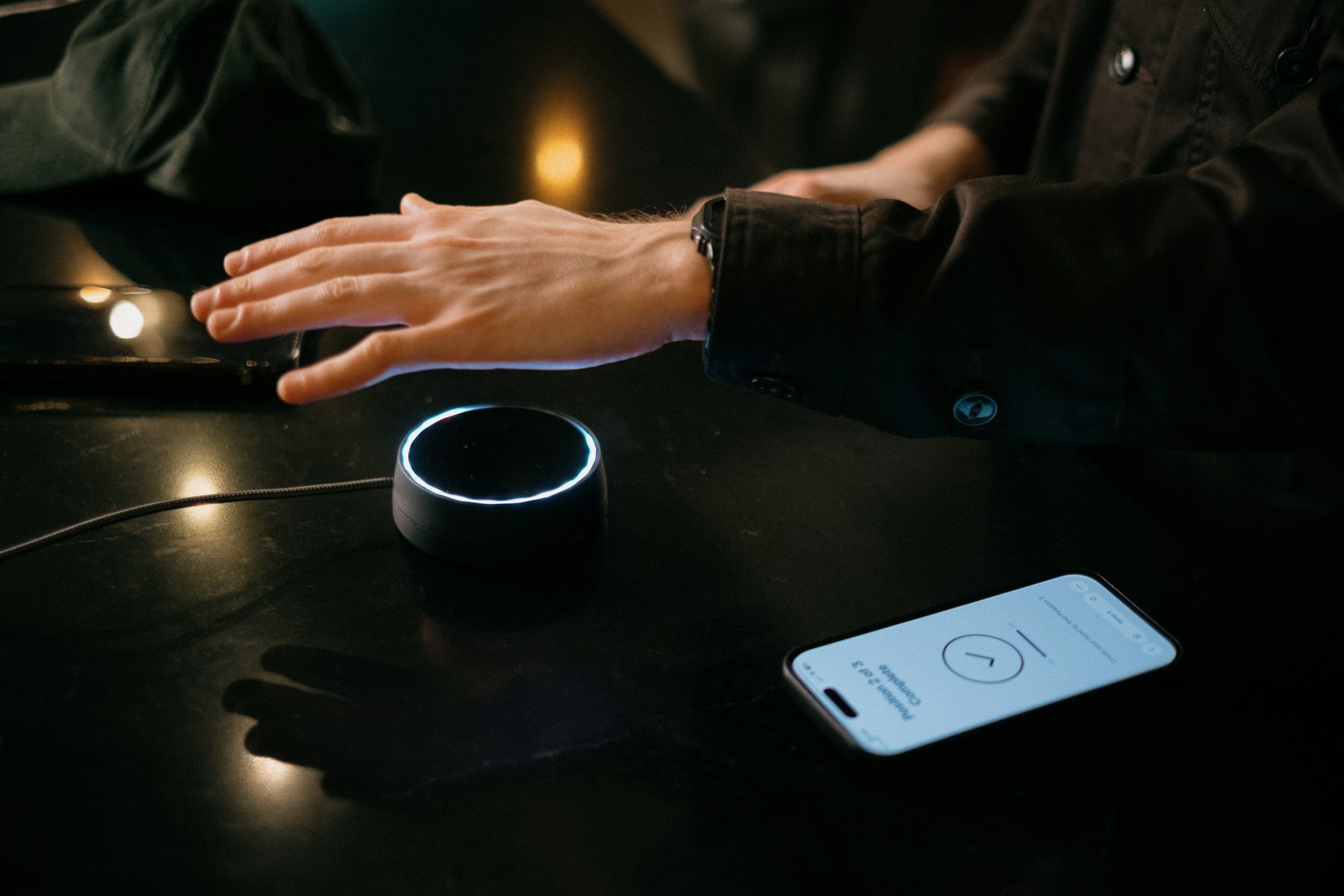
Boop is a palm-based payment and identity app that turns your hand into a universal key — for contactless payments, venue access, and membership programs — all without exposing personal data.
Designed from the ground up with privacy at its core, Boop integrates World ID verification so users stay anonymous even to the platform itself. The result is a product that feels frictionless and futuristic without sacrificing trust.
The design scope covered two distinct apps: a consumer-facing app for users to manage their palm identity, payments, and memberships — and a separate vendor app for businesses to configure Boop scanners, manage events, and track transactions.
The Challenge
Contactless payments are fast — but they still depend on a physical device. For venues, verifying age or membership means interrupting the flow with manual checks or hardware. While hand-scanning is standard in Asia and emerging via Amazon One in the US, it remains a fresh frontier in Europe. The question is: can we make the body a universal key for massive, everyday adoption?
Defining & Product approach
How it works
Create your identity
Sign up with a World ID or Boop account. Your data stays encrypted and private — even Boop can't access it.
Register your palm
Scan at a Boop device or at home. Your hand becomes your payment credential and access key.
Pay & access
Wave your hand over any Boop scanner to pay at kiosks, verify age, or unlock exclusive memberships and events.
Design principles
Privacy by default
Zero data shared. World ID ensures identity without exposure.
Frictionless payments
A wave of the hand replaces cards, phones, and PINs.
Access control
Automatic age verification and membership gating without manual checks.
Unified experience
One app for payments, event access, and merchant management.
Research and benchmarking
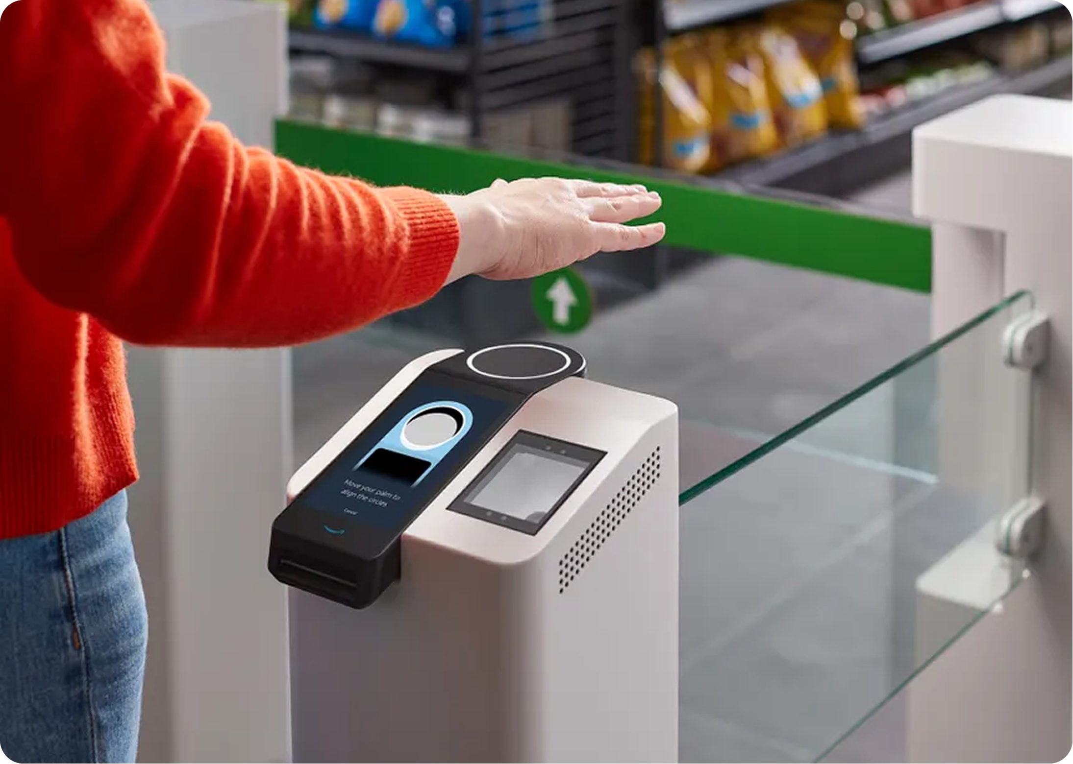
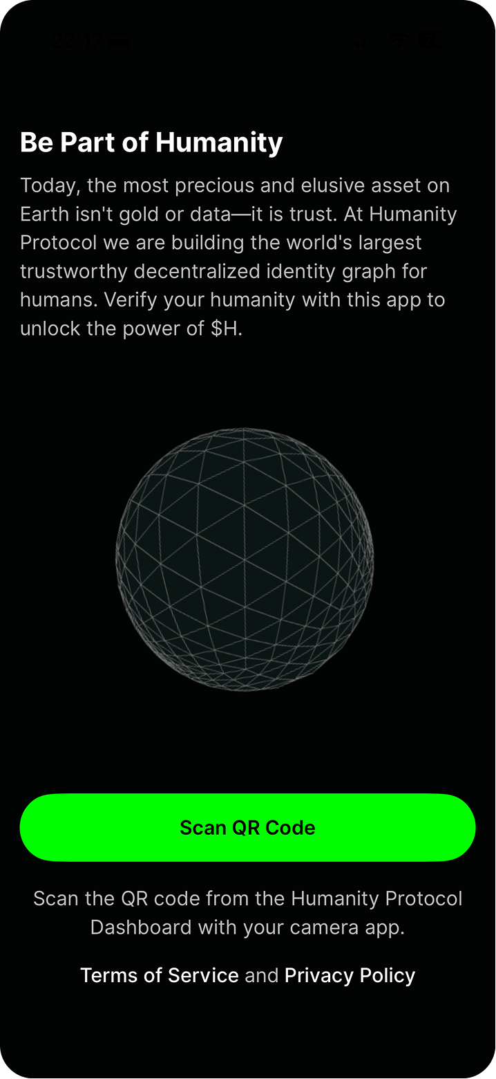
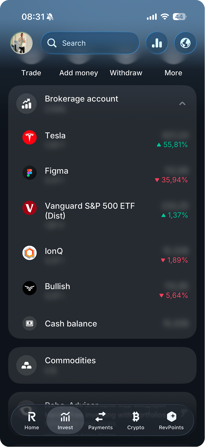
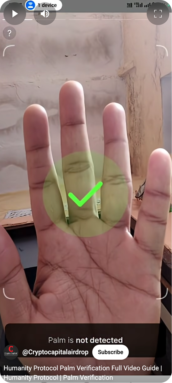
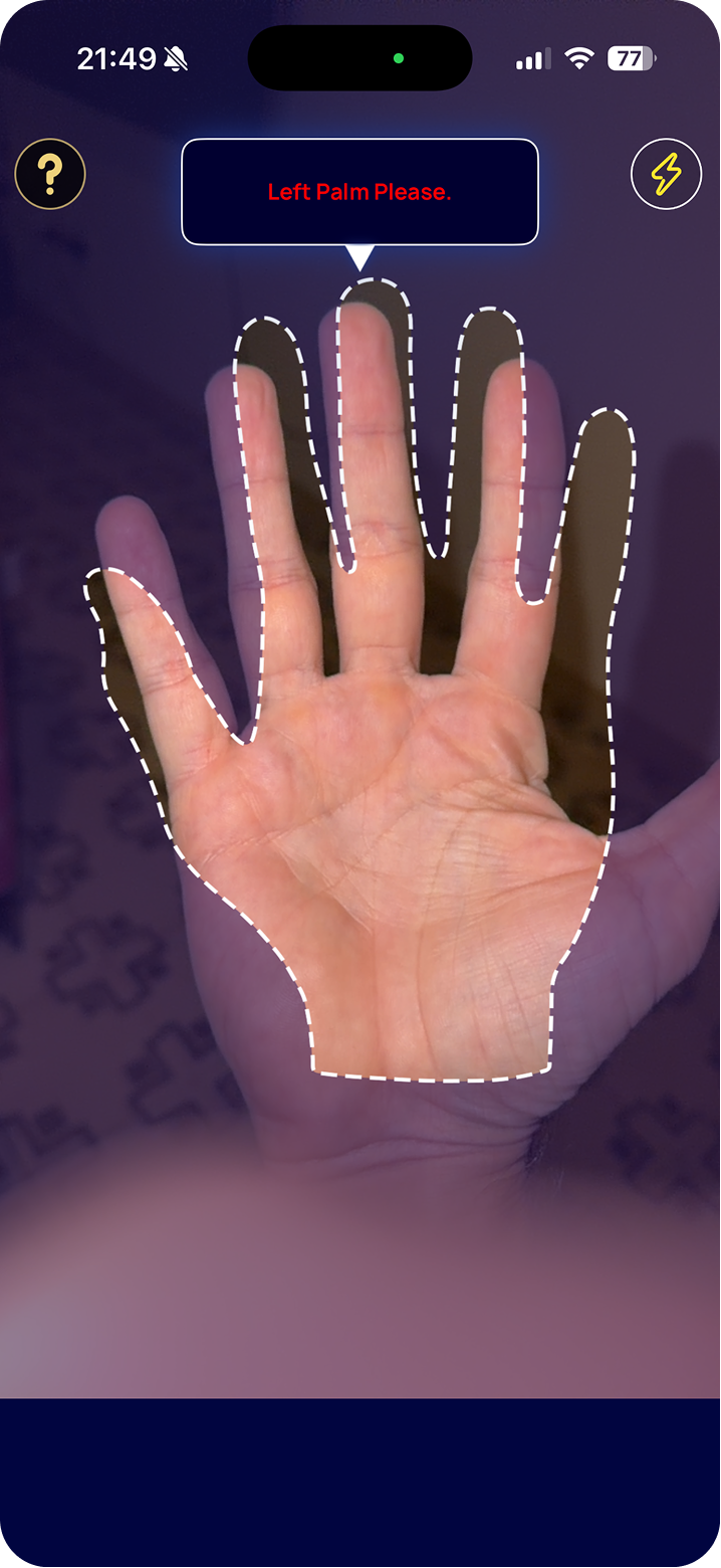
The research phase analyzed the gap between technical capability and user trust by auditing market leaders and banking ecosystems. While Amazon One and Tencent proved the speed and high retention (70%+) of palm biometrics, they remain limited by centralized data privacy and regional silos. Specialized players like Redrock Biometrics and Arobix offer superior touchless accuracy but lack consumer-facing ecosystems, whereas World App (World ID) provided the blueprint for decentralized identity using zero-knowledge proofs. Integrating these insights with an analysis of Revolut and modern banking apps confirmed that while financial hardware is already biometric-ready, a massive opportunity remains for an anonymous, platform-agnostic key that prioritizes user sovereignty over data collection.
 Amazon One
 Humanity Protocol
 Revolut
 Palm scanning UX
 Redrock Biometrics
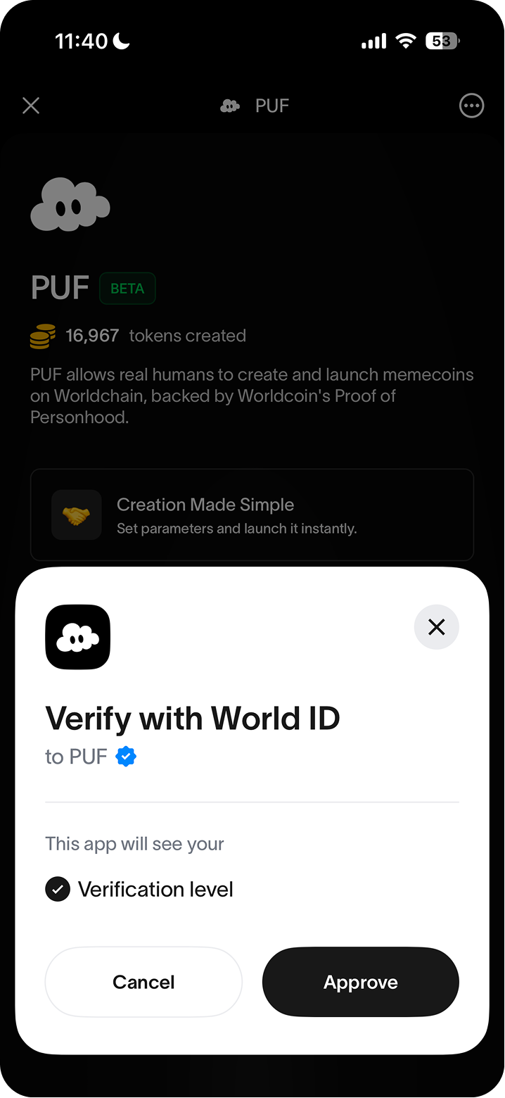 World ID
User Journey (User app)
User journey
Before any frame was opened in Figma, every flow was mapped on paper — palm registration, payments, tickets, and the full app — to understand scope and sequence before committing to any visual direction.
Steps
- Entry — App download via NFC, QR, or Magic Link, followed by Login / Sign-up.
- Verification — User provides Date of Birth and grants Biometric Access permissions.
- Scanning Choice — User selects between Boop Device or Phone Scanning.
- Error Handling — A "Scan Fails / Retry" loop manages unsuccessful biometric captures.
- Registration — User completes the process by scanning both hands.
- Card Integration — User enters Cards Screen to add a card (scan or manual) and links palm(s) to it.
- Activity — User reviews All Transactions and specific Transaction Details.
- Management — User updates permissions, links different hands, changes account name, or adds new devices.
Validating functionalities
Low fidelity
Low-fidelity sketches were used to stress-test the core flows — registration, payment, ticketing, and the main app surfaces — before committing to any visual direction. The goal was to surface structural issues early, when changes cost nothing.
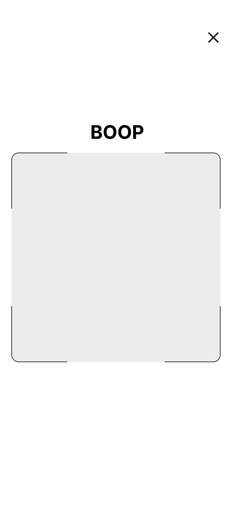
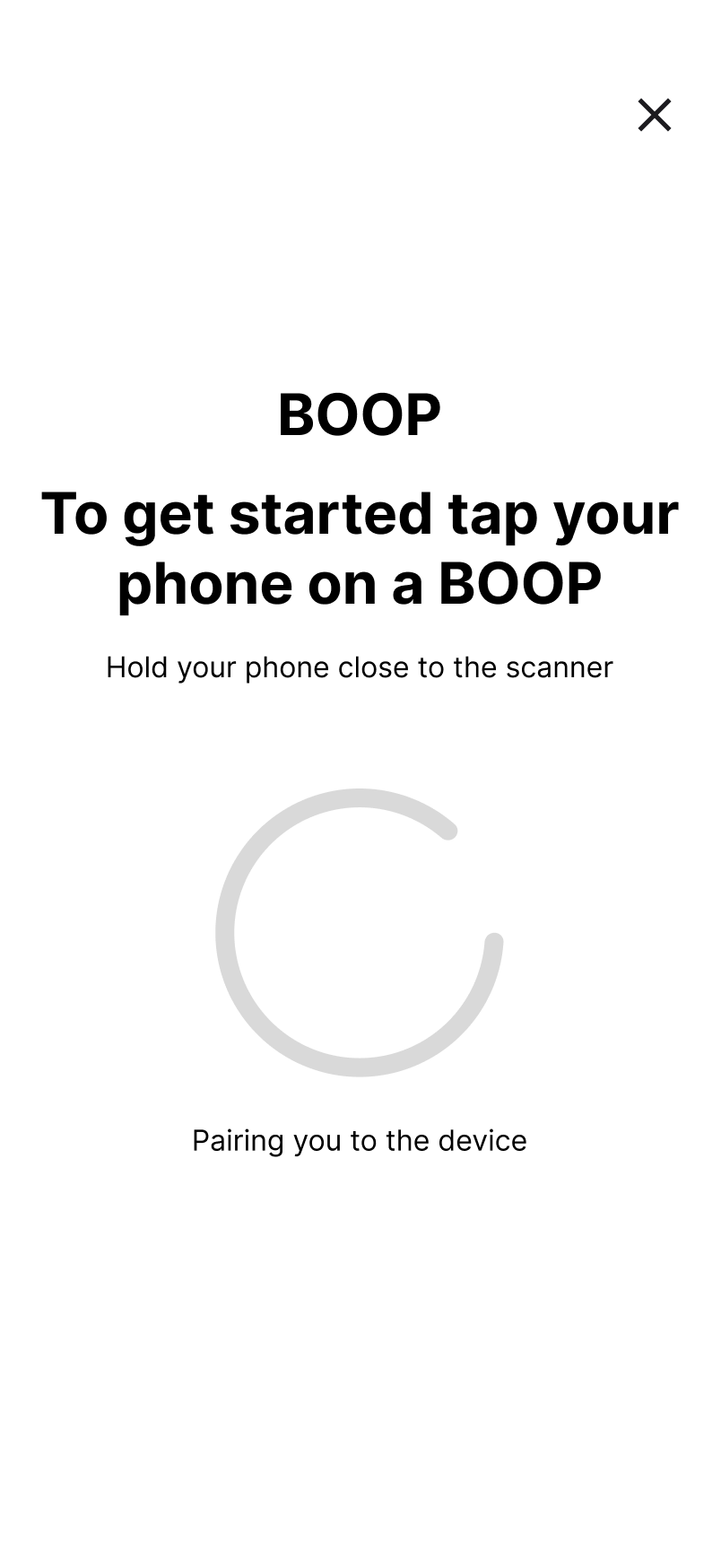
Welcome screen and pairing device
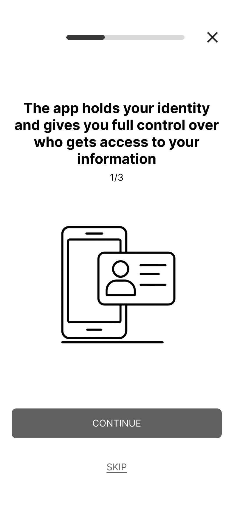
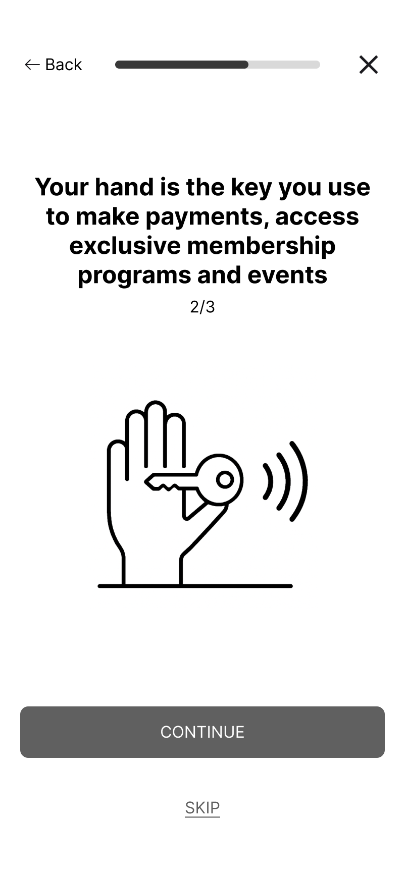
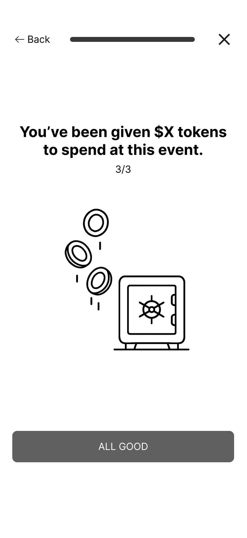
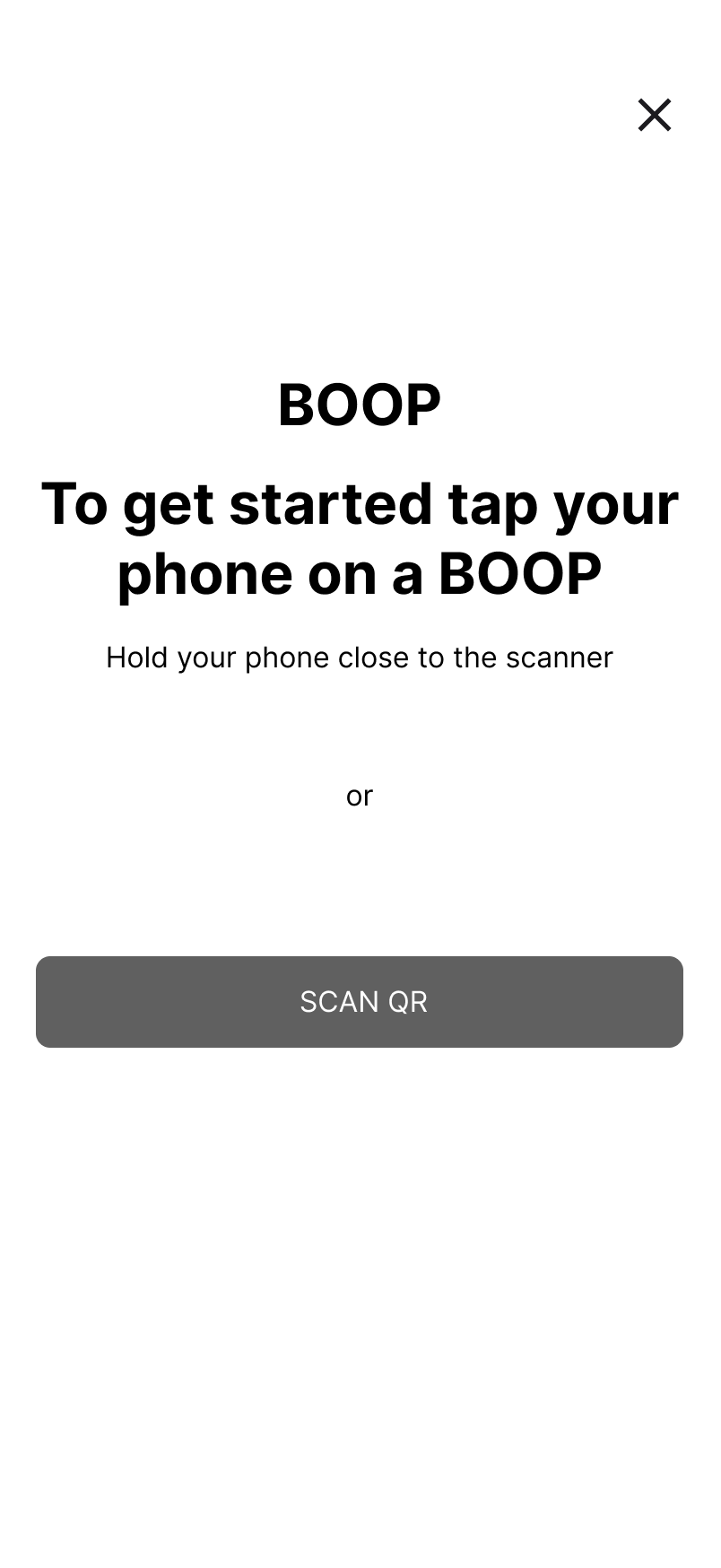
Welcome flow + NFC device pairing — explaining what Boop does before asking users for anything.
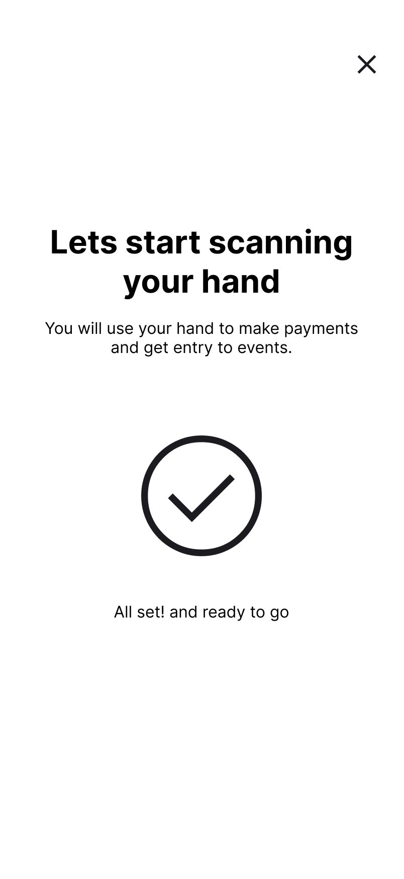
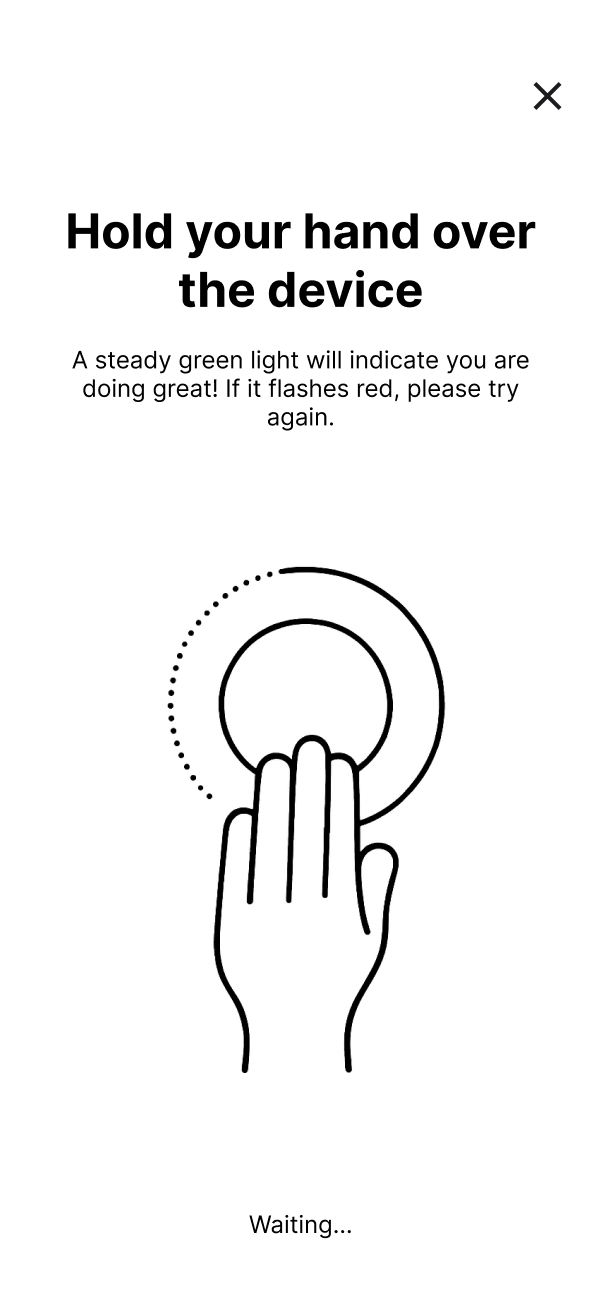
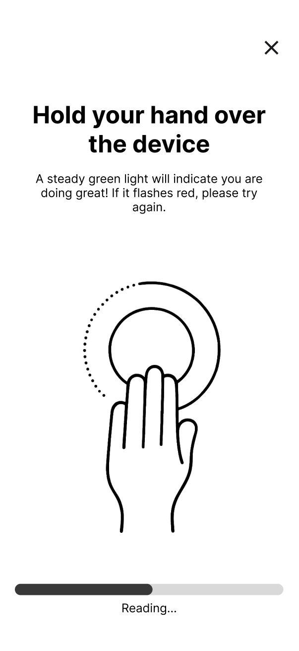
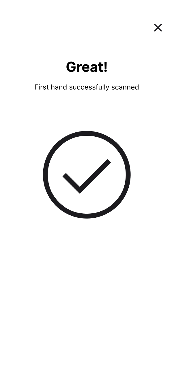
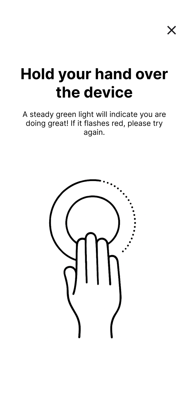
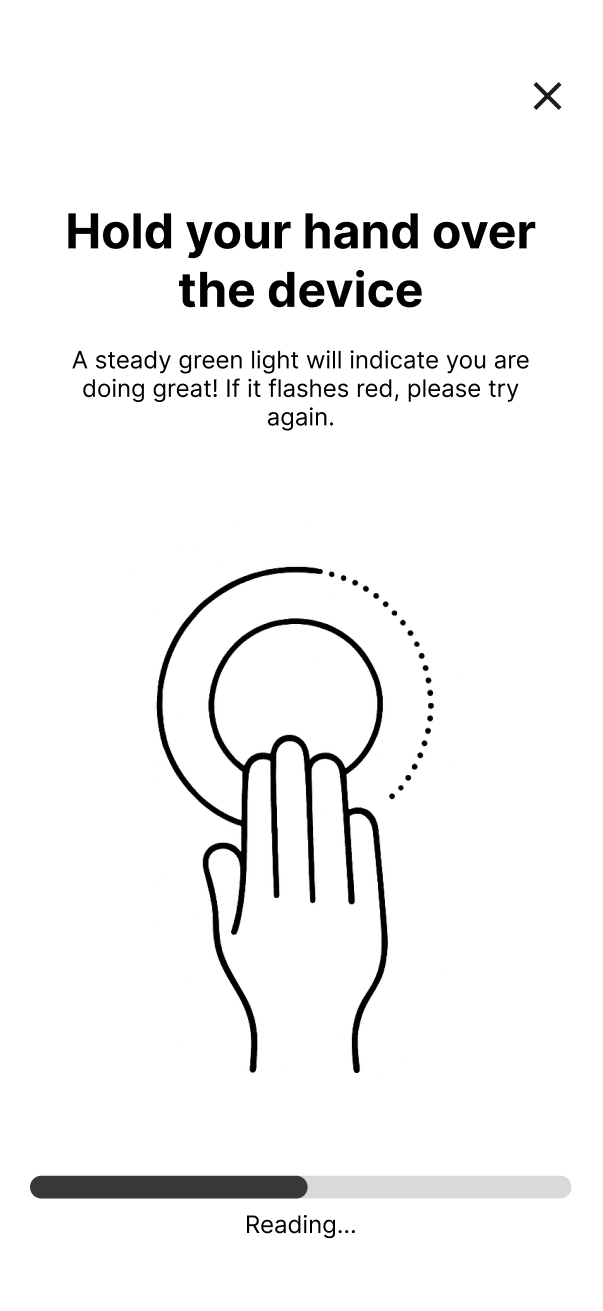
Scanning and registration process
First-time account creation via palm scan. Both hands are scanned sequentially — waiting, reading, and confirmation states for each.
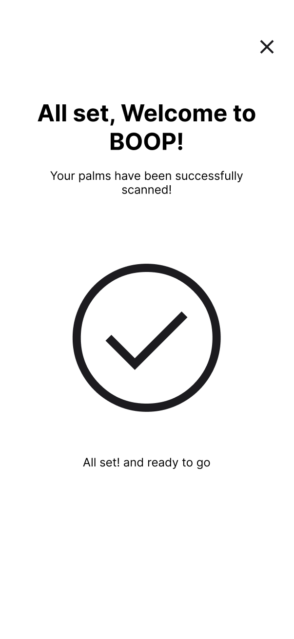
Home page and core features
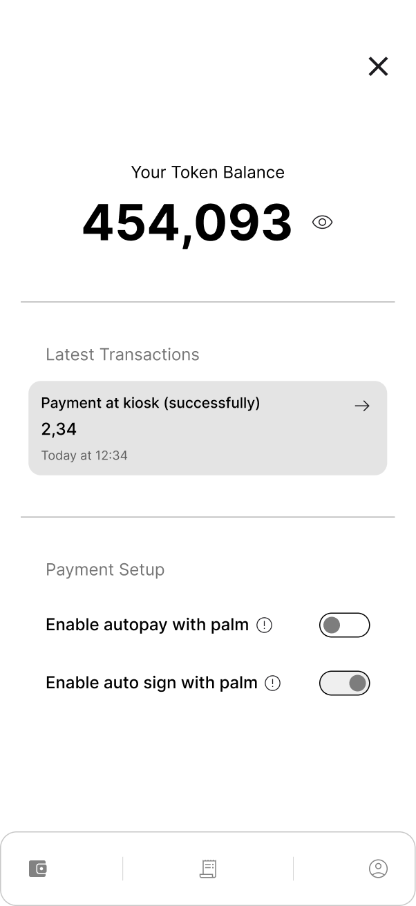
The idea was to unify everything in one screen — transactions, membership details, and data-sharing settings.
At this point the idea was to test this in an event.
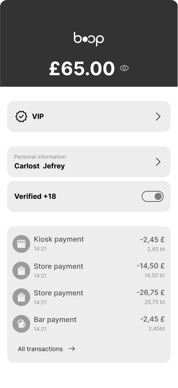
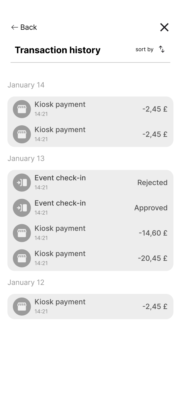
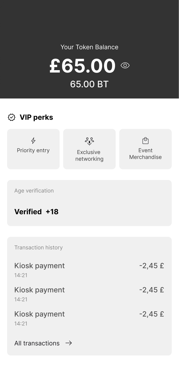
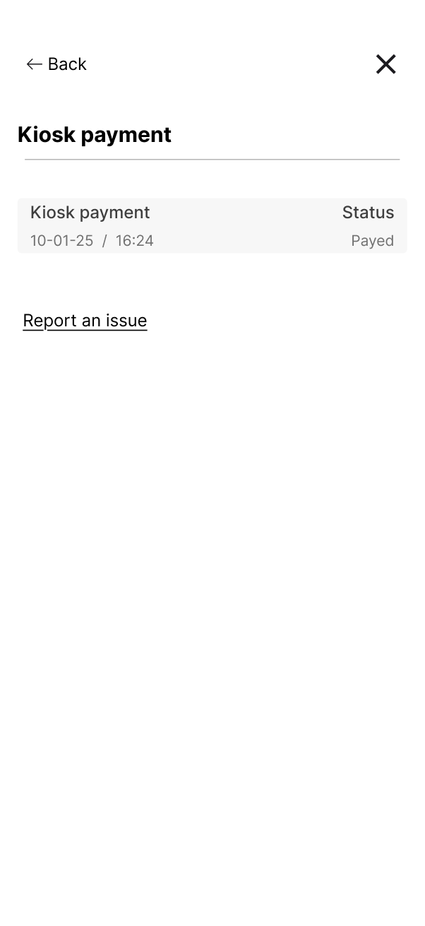
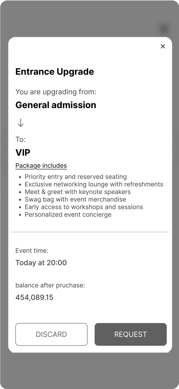
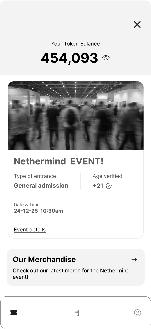
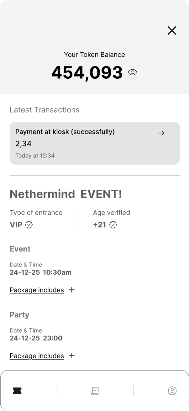
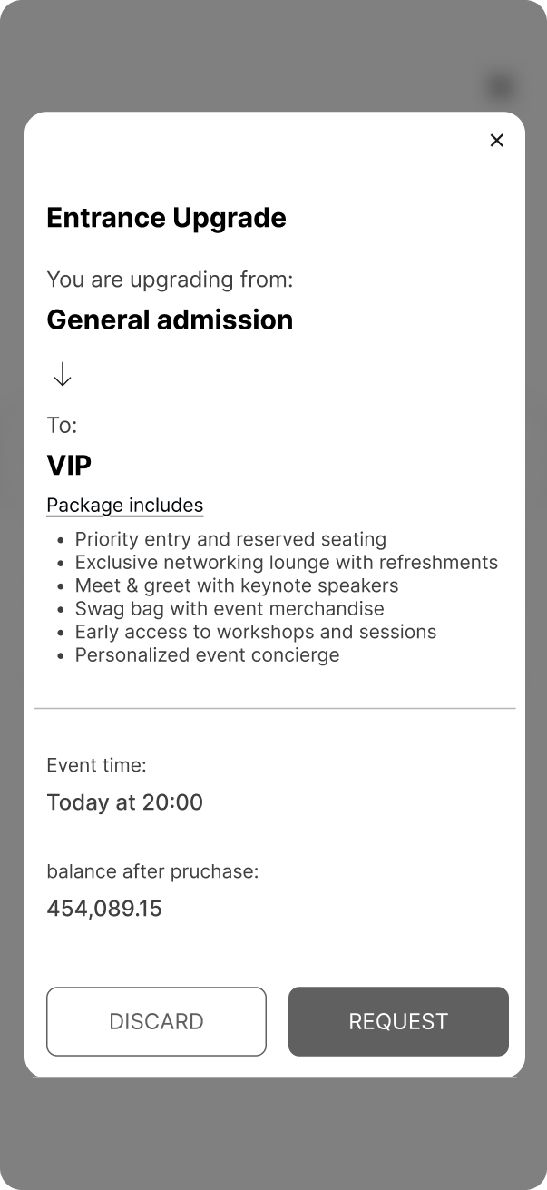
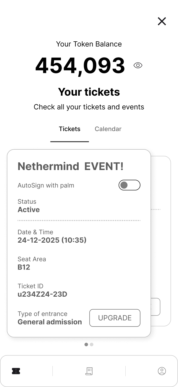
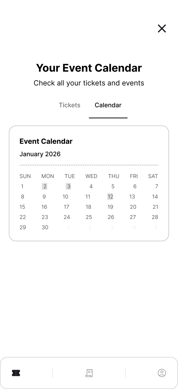
Other screens related to the event — not used
Additional event-context screens that were explored but cut — including ticket upgrades and VIP package flows.
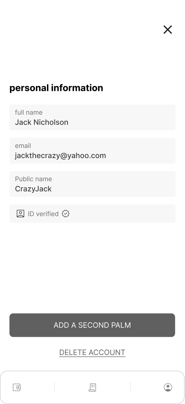
Preliminary insights
Usability tests were run with the app only — the device wasn't ready for testing yet. Users found the app simple and easy to use, but consistently asked for separate screens. Having transactions, settings, and a profile entry point all in one place felt narrow and created high cognitive load. The unified screen didn't leave room to scale. The core takeaway: the product needed dedicated sections, not a single surface trying to do everything. Despite this, users clearly understood what Boop was about — the concept landed, the structure didn't.
Post event
High fidelity V2
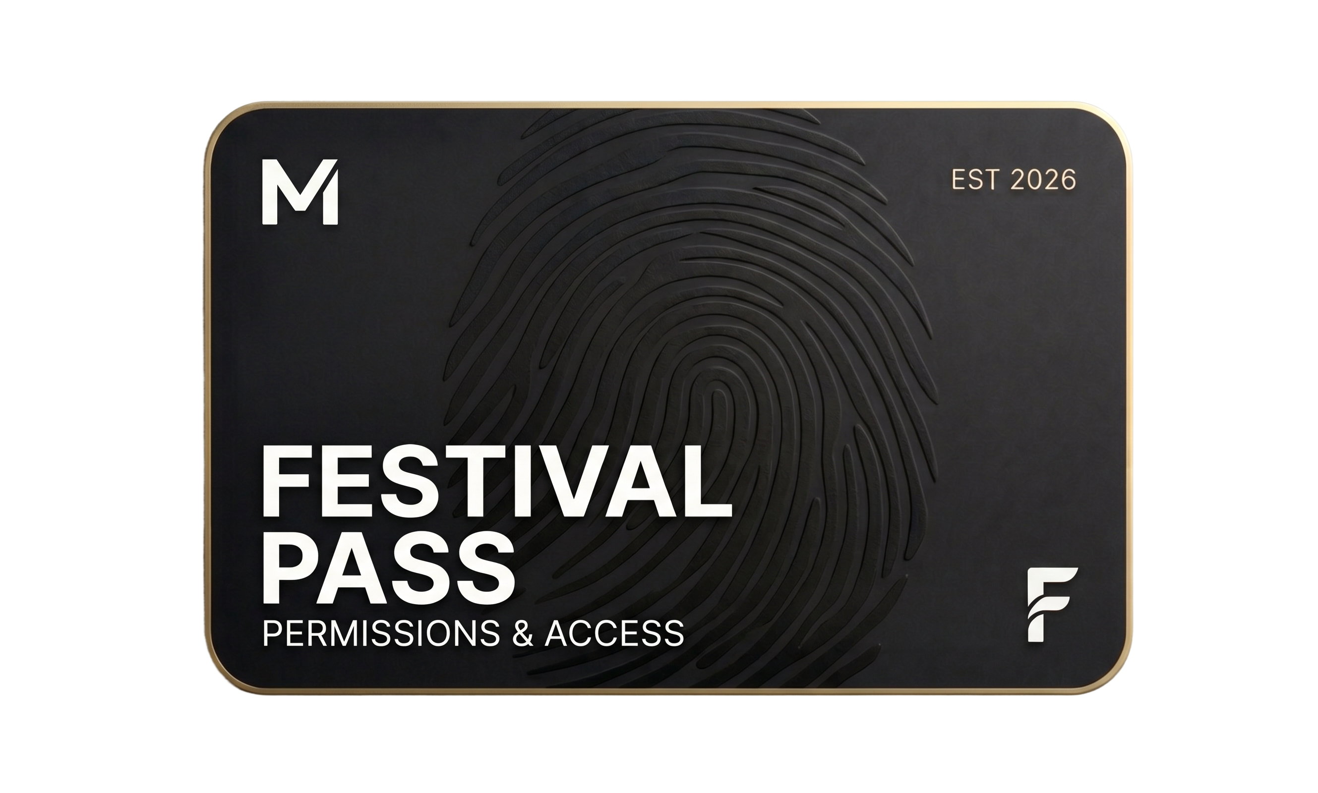
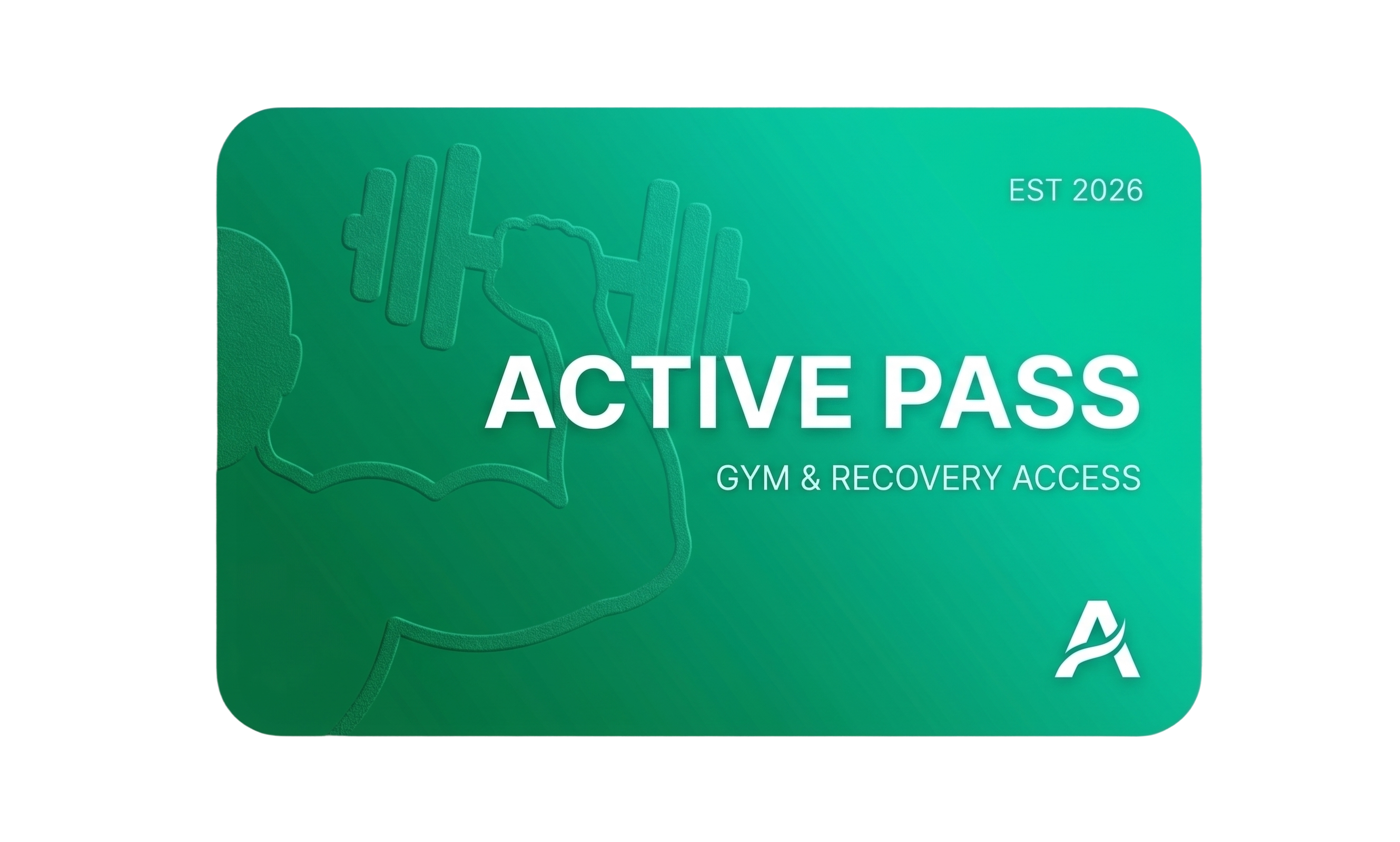
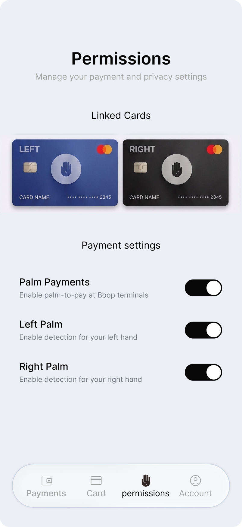
Over 5+ months of iterations, the product was continuously refined to reach this point. Despite being satisfied with where it landed, the team recognised Boop as a living product — one that would require ongoing iteration informed by real user behaviour post-launch.
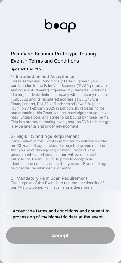
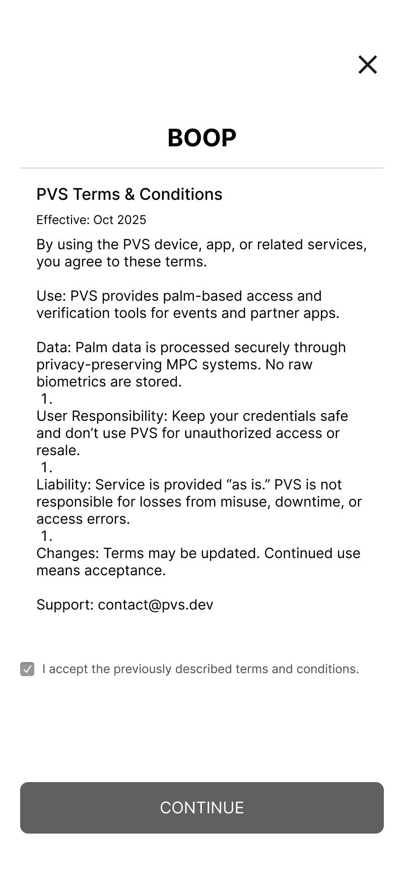
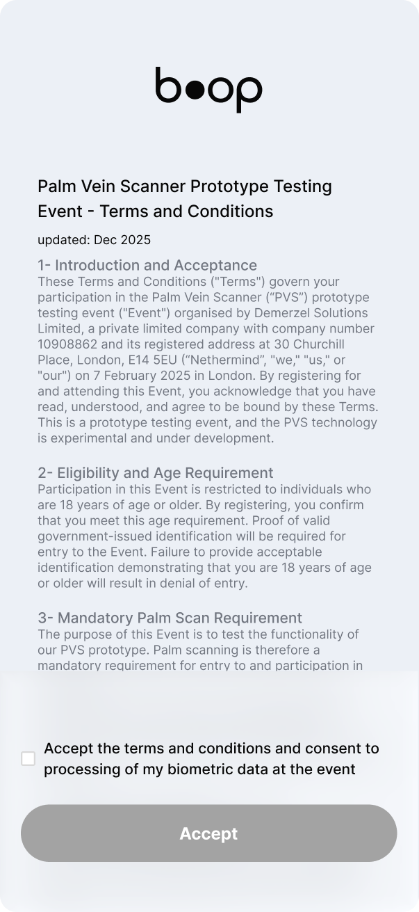
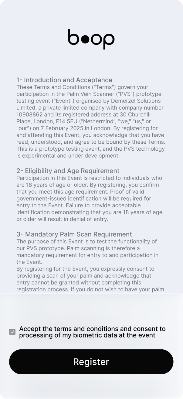
Accept the terms and conditions and consent to processing of my biometric data at the event
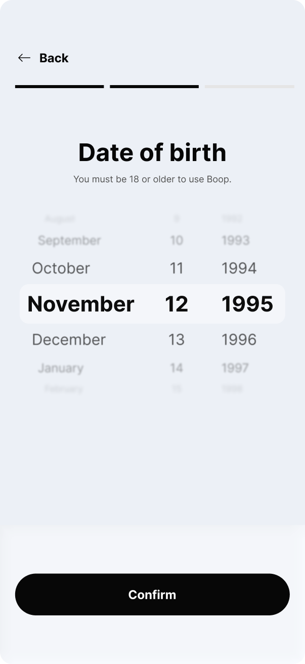
Date of birth
You must be 18 or older to use Boop.
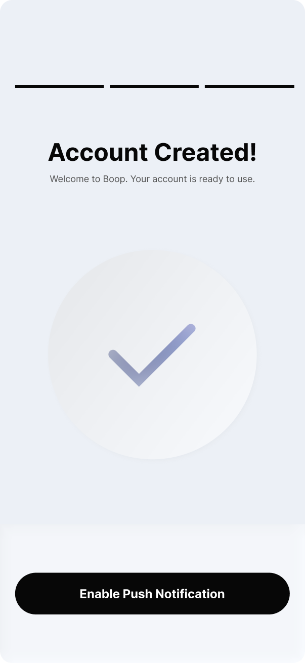
Account Created!
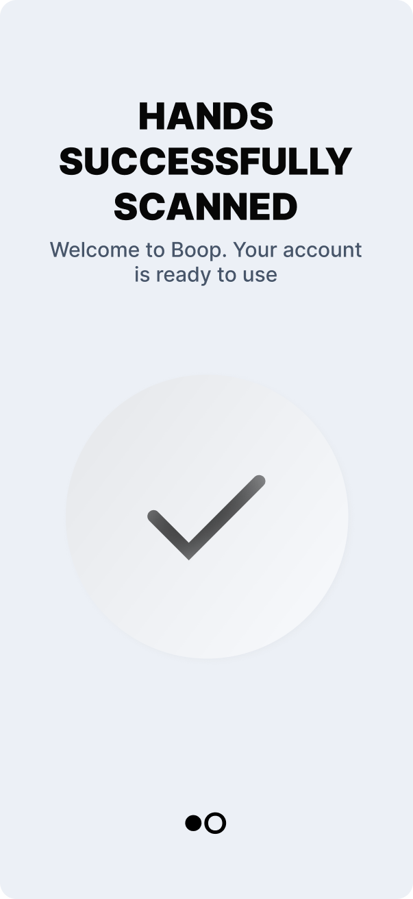
Welcome to Boop. Your account is ready to use.
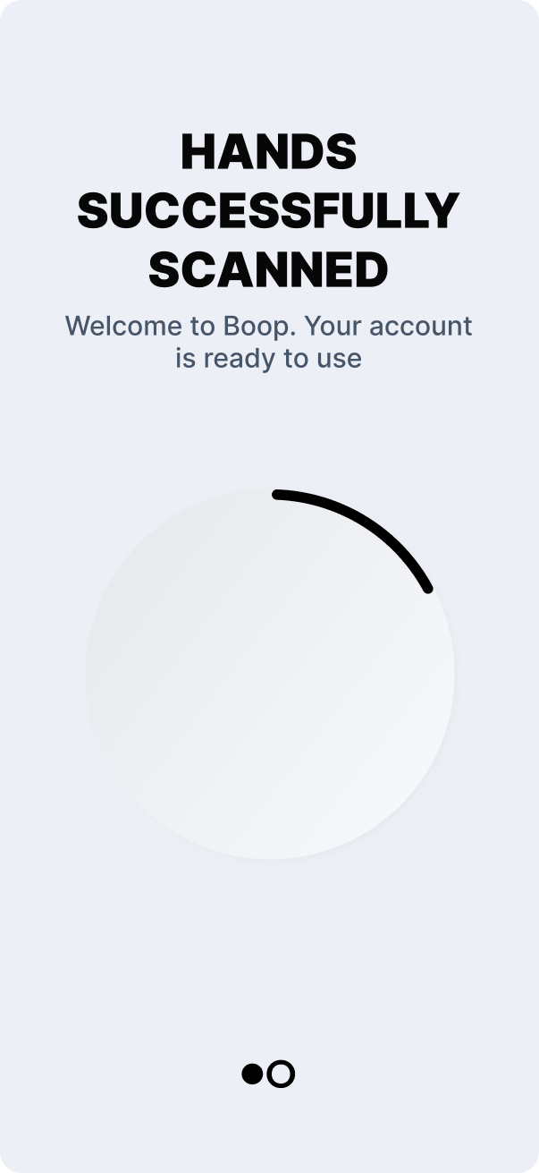
SUCCESSFULLY
SCANNED
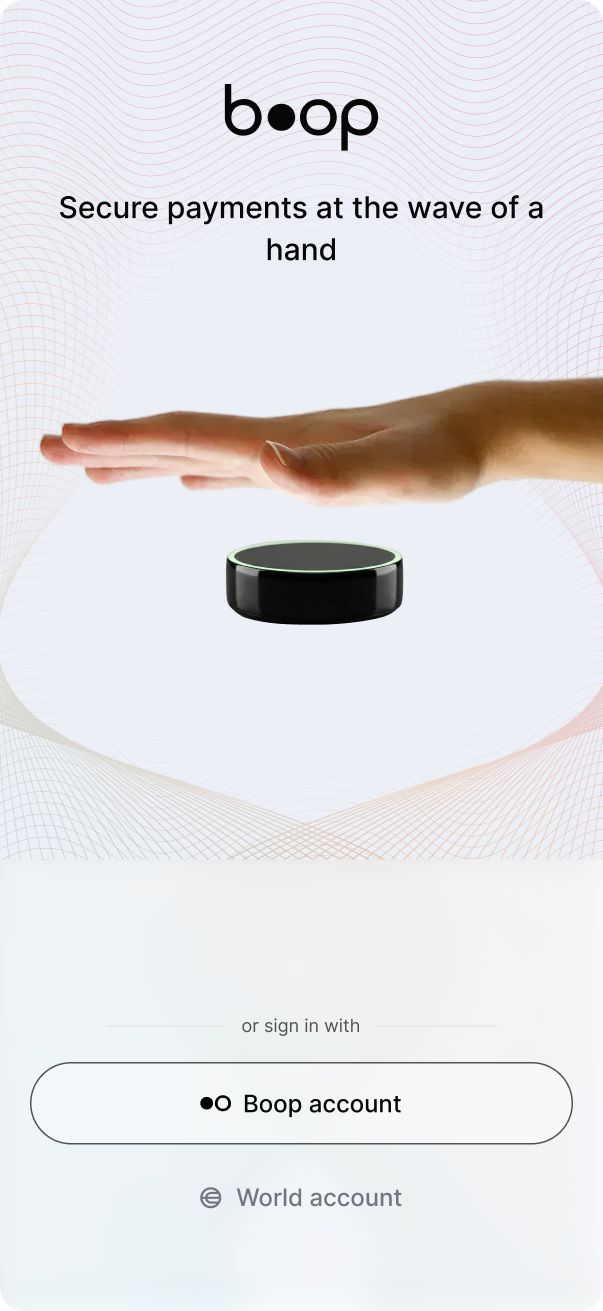
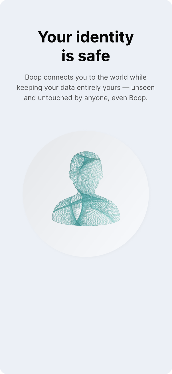
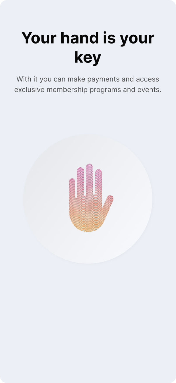
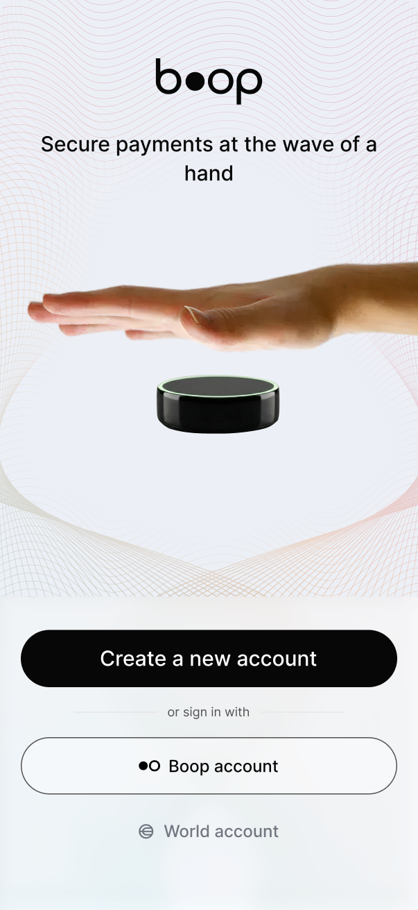
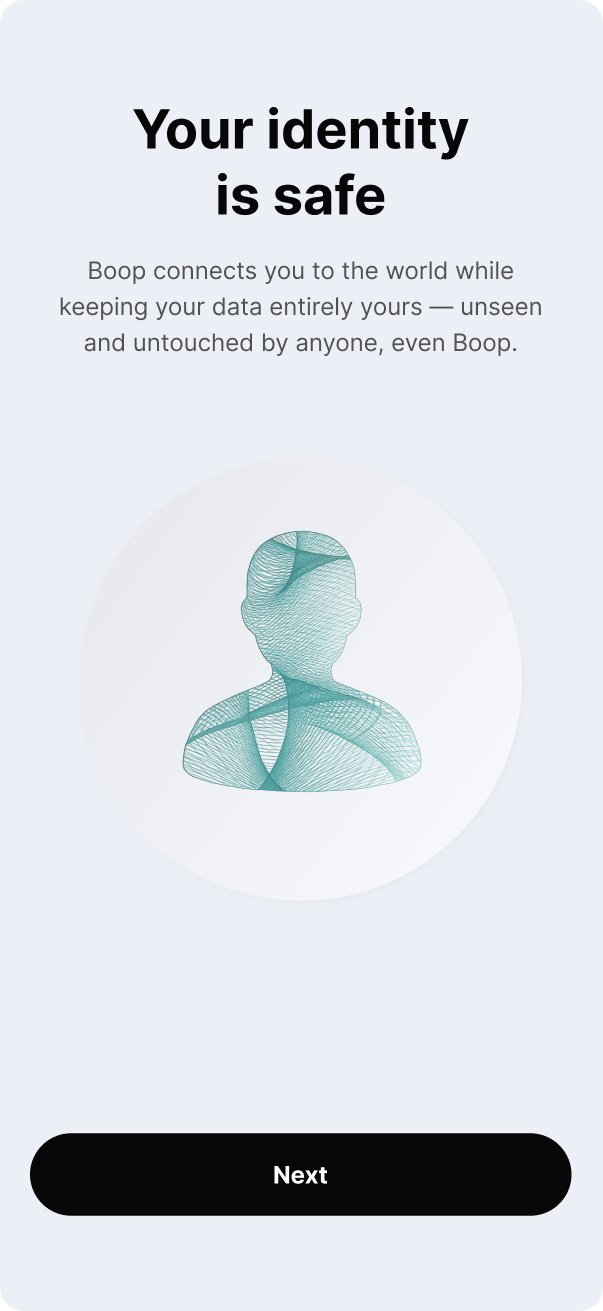
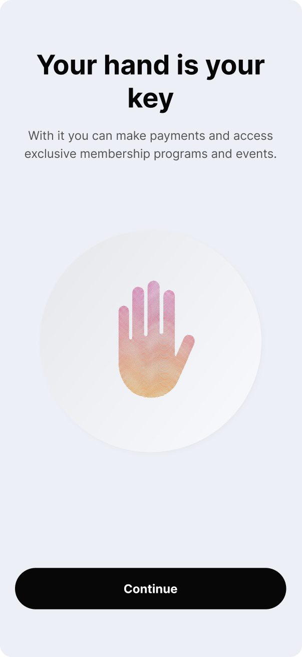
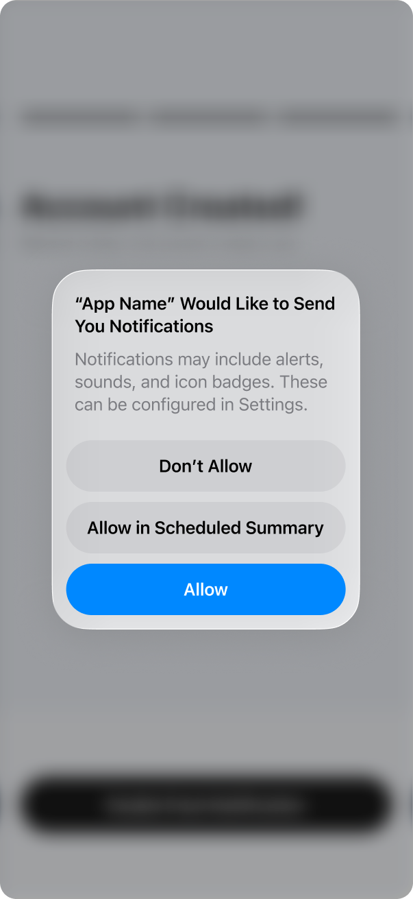
The app now ships as a native binary on iOS and Android, unlocking platform-level haptic feedback throughout the entire flow — from onboarding slides to account confirmation. Users are guided from a clear splash with three entry points, through privacy-first onboarding, terms acceptance, date-of-birth verification, and straight to a confirmed account ready to use.
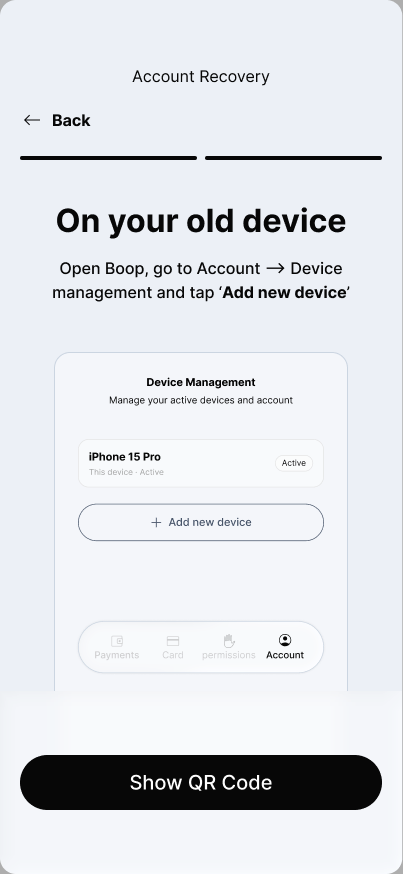
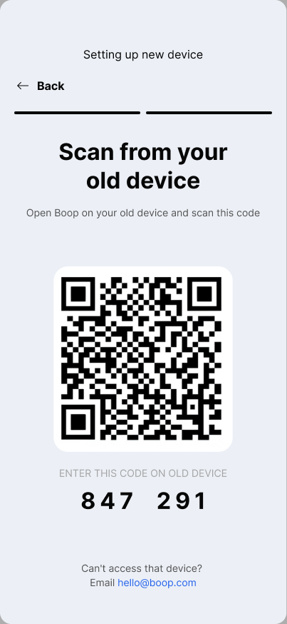
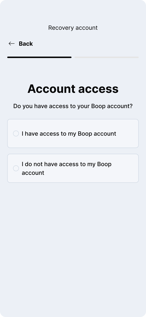
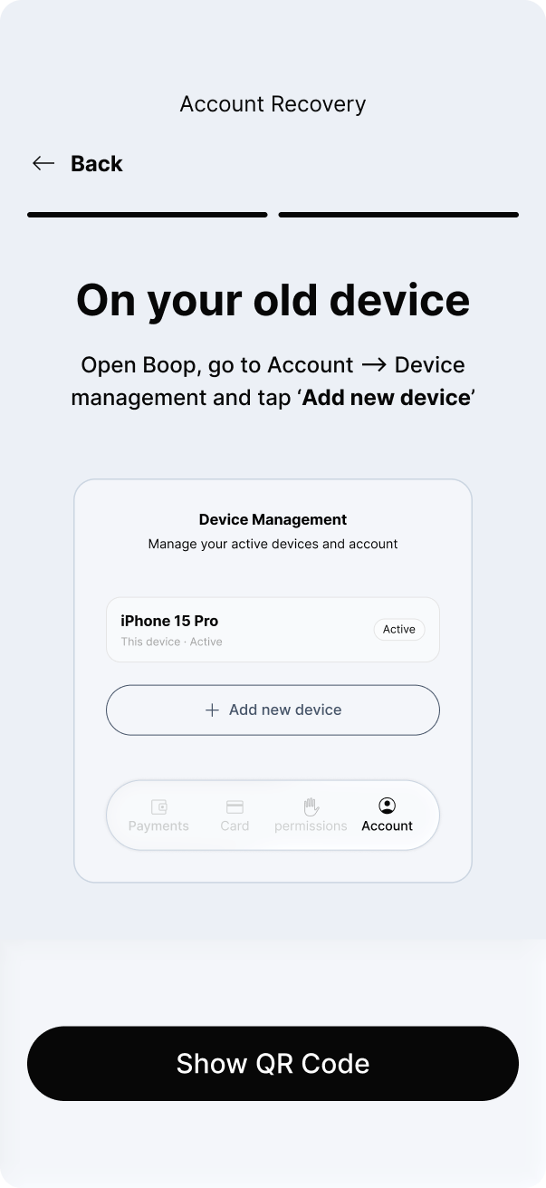
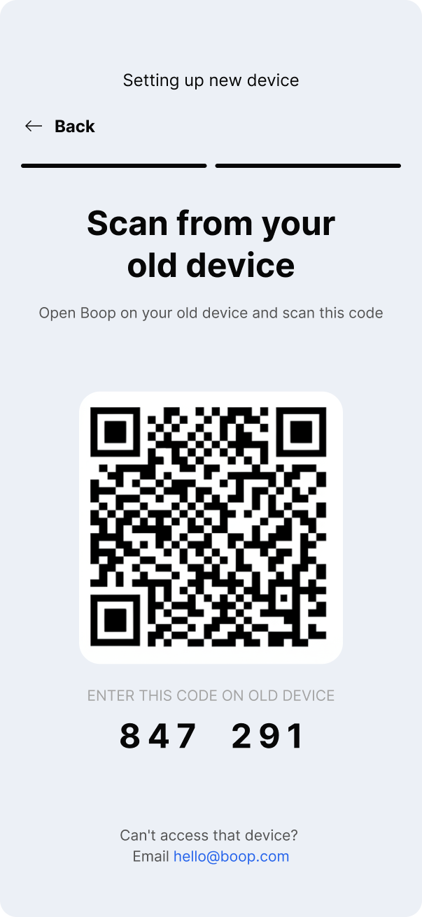
Switching devices doesn't mean losing access. Users are first asked whether they still have their old device — if they do, a simple QR code flow transfers the account securely. Device management lives inside the Account tab, keeping control always one tap away.
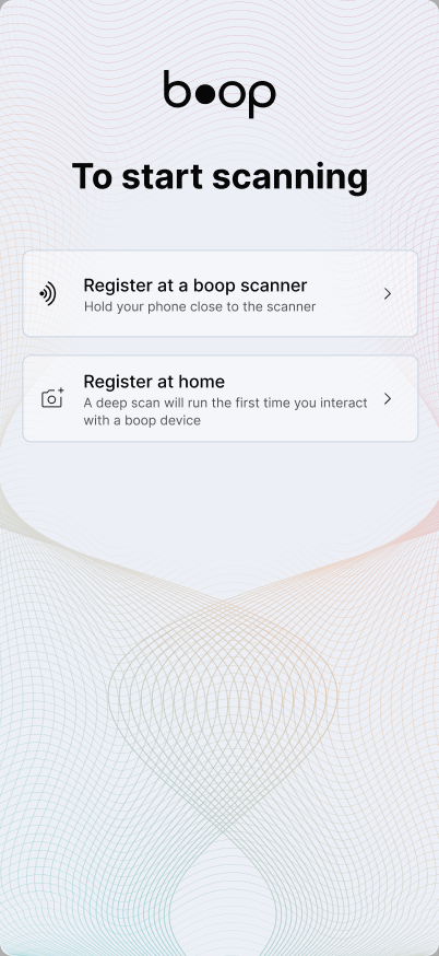
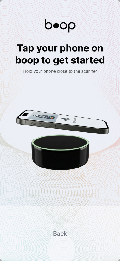
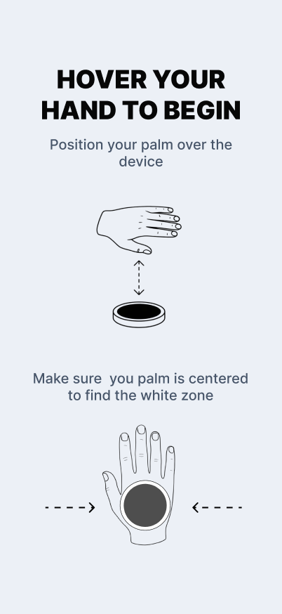
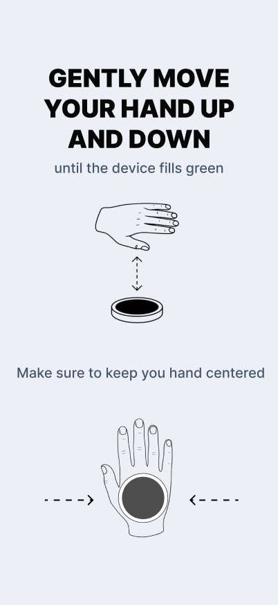
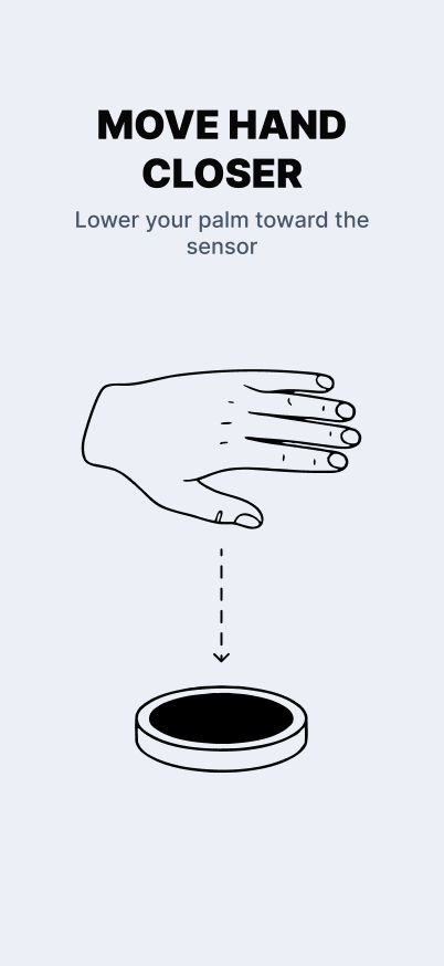
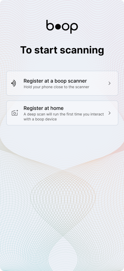
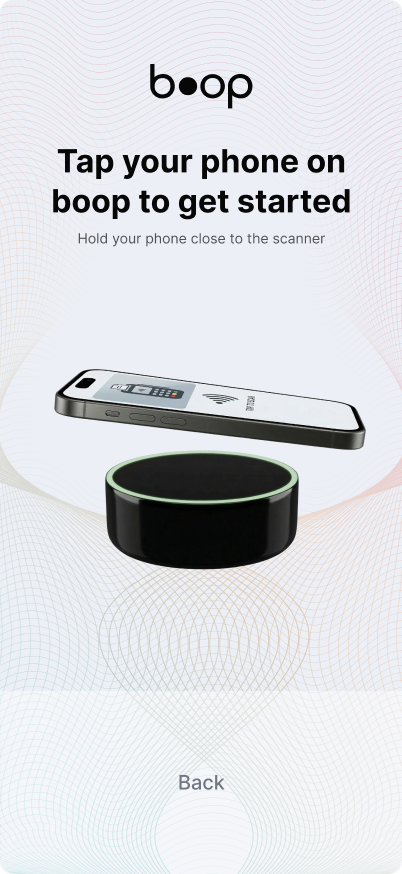
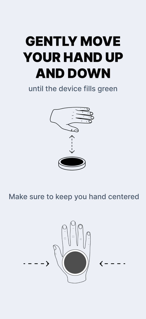
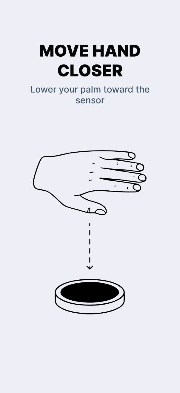
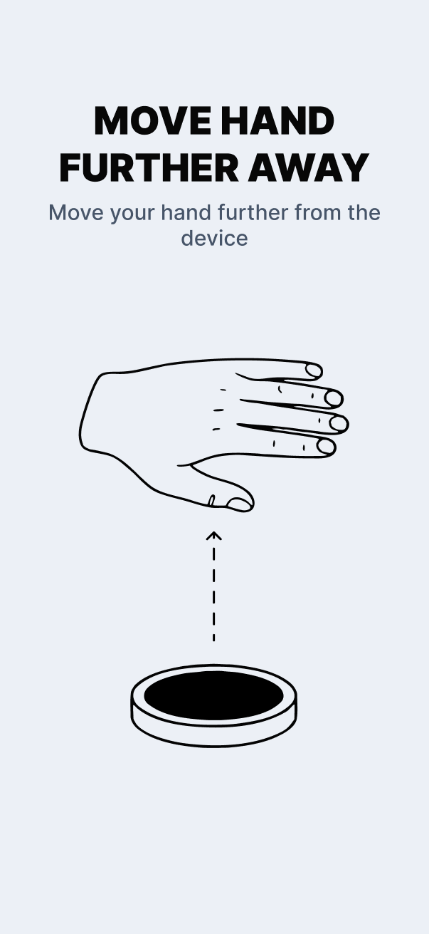
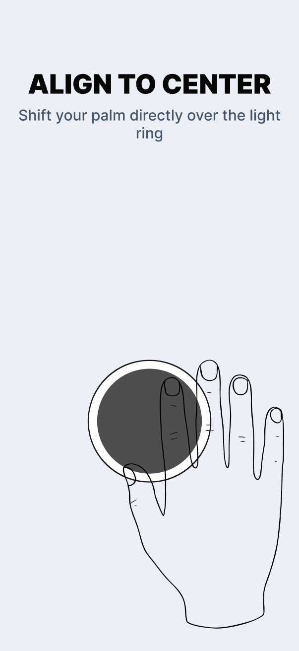
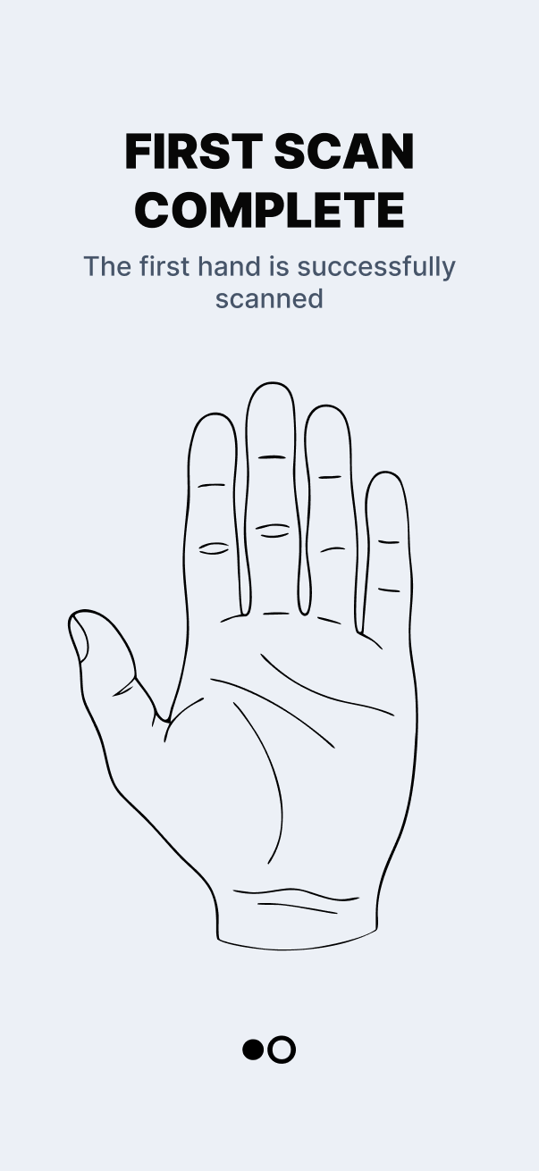
Palm registration can happen at a Boop scanner or later at home. Once near a device, the app guides the user through a step-by-step hand-positioning flow — real-time feedback directs them to move closer, further, or re-centre until both palms are captured. A haptic pulse confirms each successful scan, and a final confirmation screen closes the loop.
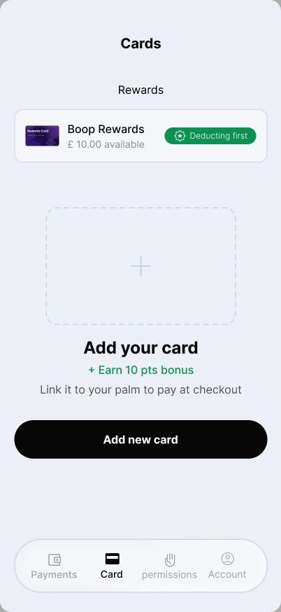
Cards are linked directly to a palm, not just to the account. Users can scan the card with the camera or enter details manually, then assign it to both hands, left only, or right only — giving them precise control over which palm triggers which payment method. The Card tab shows the full wallet state at a glance once setup is complete.
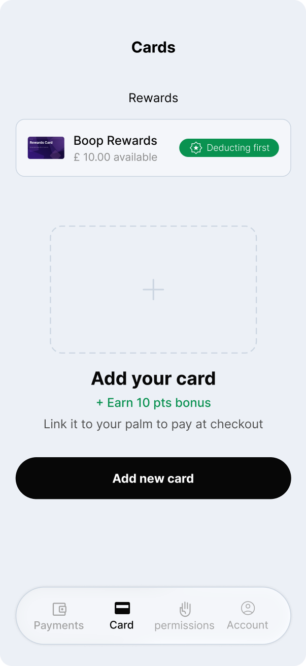
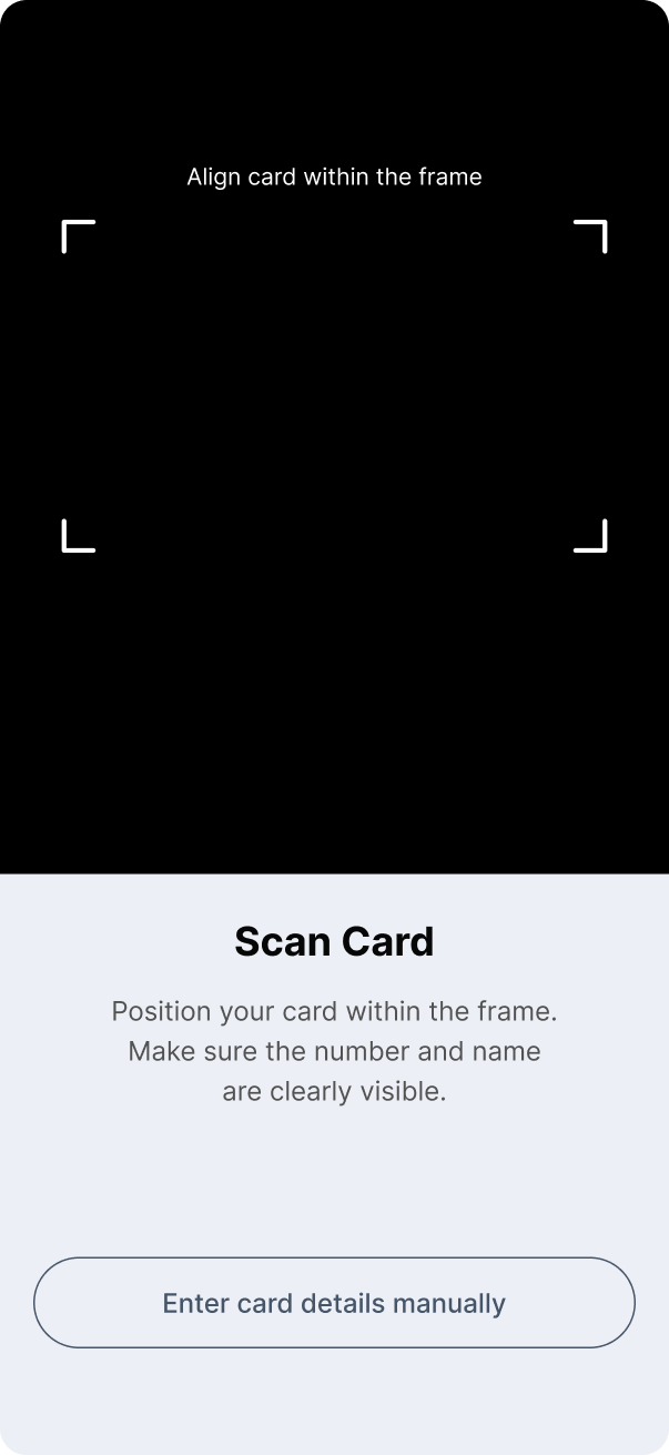
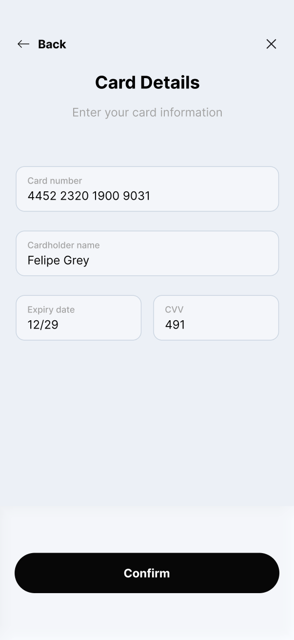
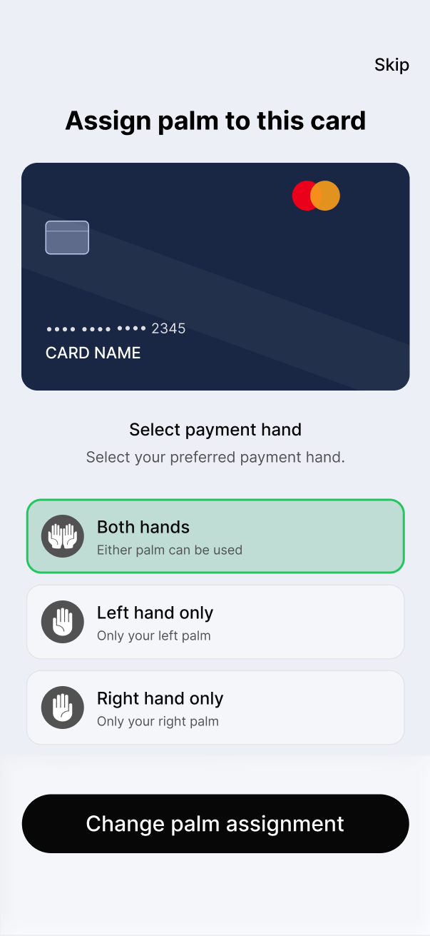
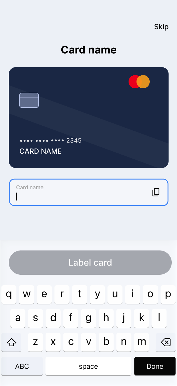
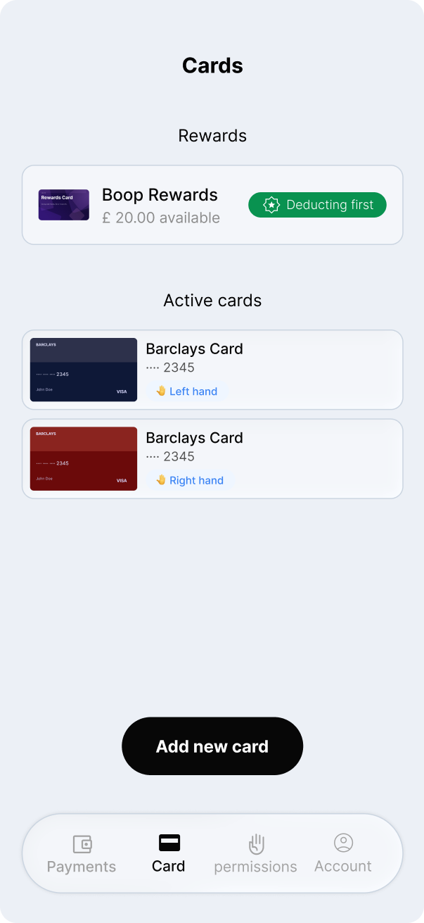
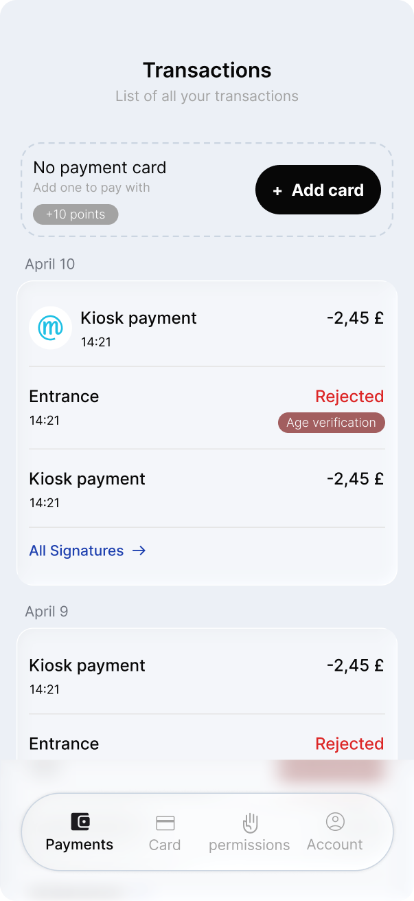
The four main tabs cover everything a user needs day-to-day. Payments lists every transaction with status and rejection reasons. Cards shows the active wallet with per-hand assignments. Permissions lets users toggle palm detection independently for each hand and review linked cards. Account handles profile, device management, and data controls — all in one place.
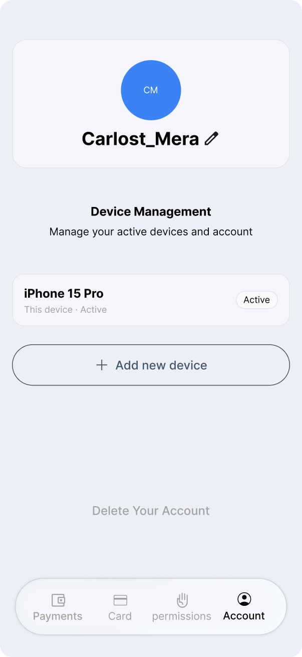
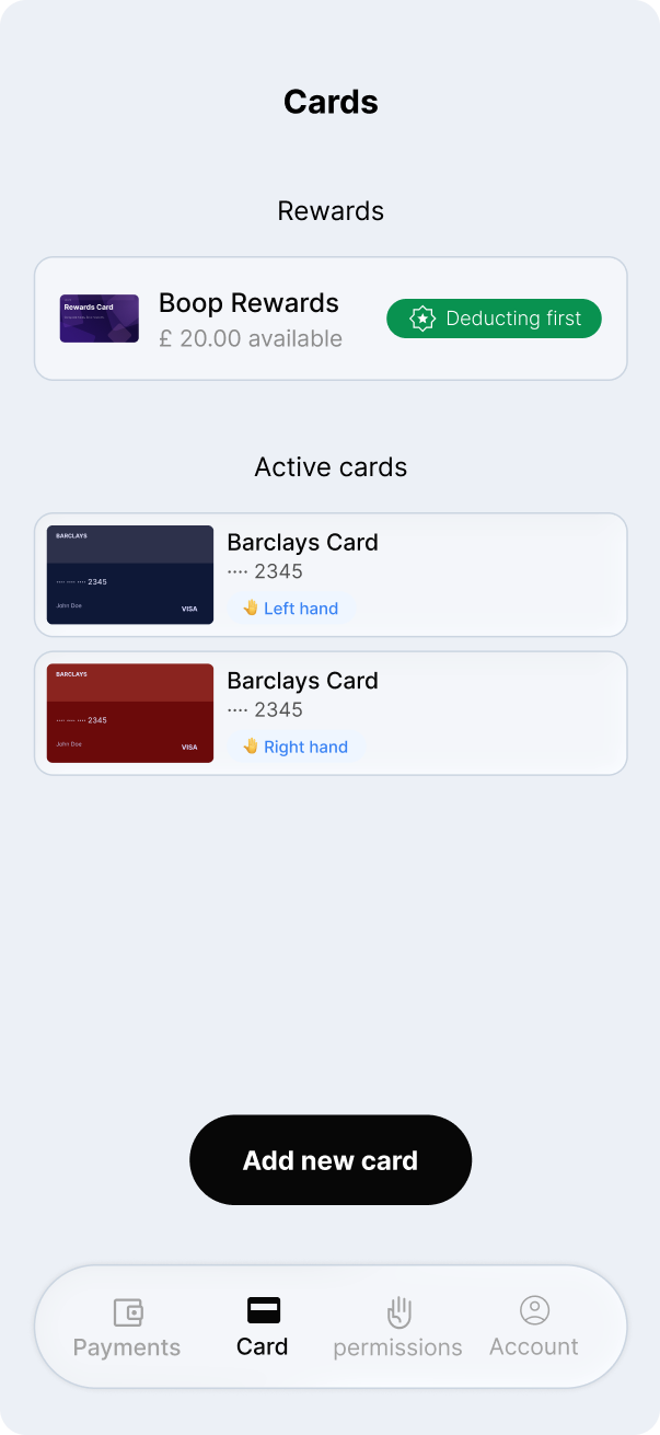
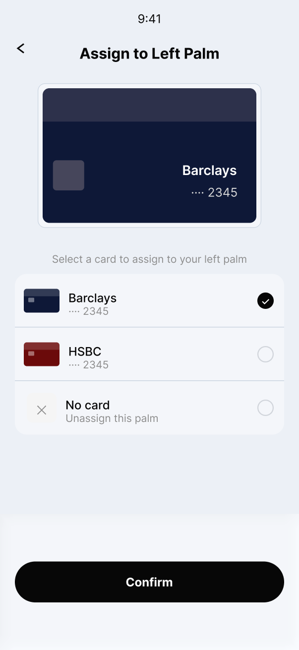
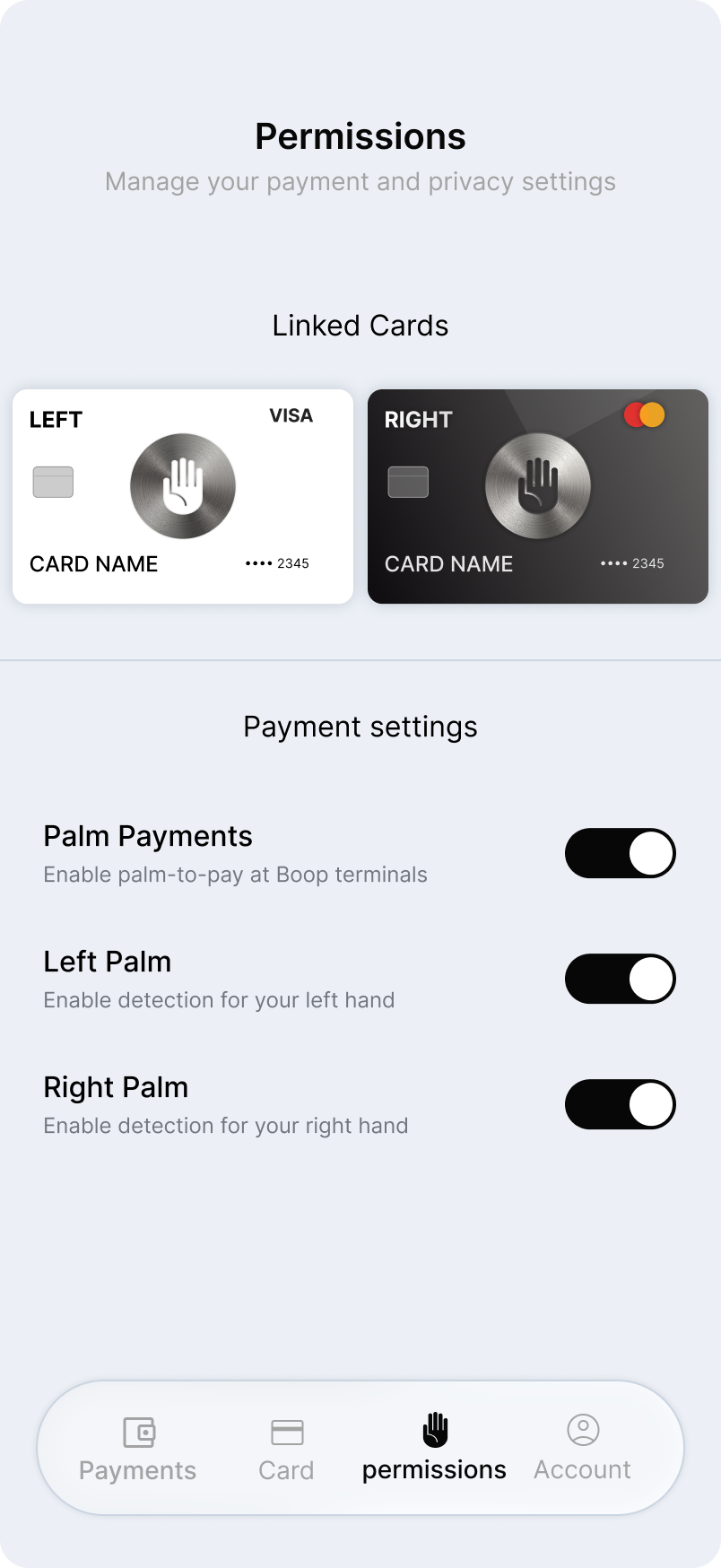
Design System
The engine behind the product
A design system isn't about colours — it's about efficiency and trust at scale. Every component was built to be unambiguous, consistent, and extensible.
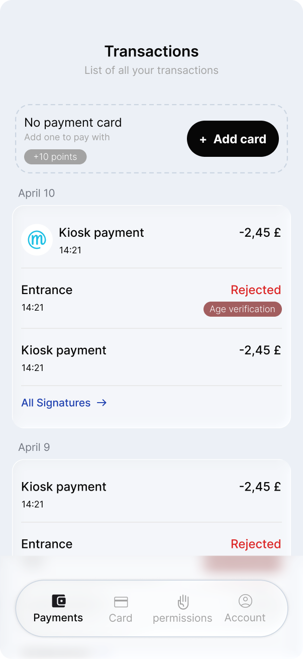
Component logic — four-tab navigation
The bottom nav maps directly to the four core concerns of the product. Each tab is a decision about cognitive load — keeping every area focused and immediately accessible without nested menus.
- Transactions grouped chronologically by date
- Age verification rejections surfaced inline with context
- Card onboarding prompt with loyalty points incentive
- Cryptographic signature trail for full auditability
Typography
Inter throughout — bold display headings for moments of delight, regular weight for transactional clarity. A tight scale that never competes with content.
Colour
Light blue-grey surface (#ECF0F6) with pure black CTAs. Teal for identity, coral-orange for palm — each colour carries a specific semantic meaning.
Components
Button panel, selector, scanner prompt, transaction row, card assignment — a tight component set covering every core interaction pattern in the product.
Scalability
Every token and component was built to extend — merchant dashboards, wearable screens, and partner integrations all share the same base system without forking.
Color system
Primitives & semantic tokens
Seven primitive palettes — each with 11 steps — power a complete set of semantic tokens covering text, surfaces, borders, interactive states, status feedback, and the rewards system.
Text
Background
Surface
Border
Interactive
Status
Spacing & Radius
Scale & shape
A single spacing scale from 4px to 128px keeps rhythm consistent across every layout. Nine radius steps — from sharp to pill — define the shape language of every component.
Spacing
Border Radius
Typography
Inter is the primary typeface across all surfaces. Styles are defined as tokens combining size, weight, and line-height.
Button
Core interactive element with three variants, two sizes, three states, and optional icon support. Full-pill shape, min-width 260px.
Input
Floating-label text field for collecting user information. 62px height, 12px radius, 16px horizontal padding. Supports placeholder, helper text, and six interaction states.
Selector
Segmented control for switching between views or modes. Full-pill container at 68px with an 8px inset, active pill at 52px.
Option Card
Glass-effect radio button card for selecting a single option. 80px height, 8px radius, backdrop blur. Used in recovery and onboarding flows.
Toggle
Boolean switch with ON/OFF text labels. 62px wide pill, two sizes. ON uses black (#070707), OFF uses gray (#A3A3A3). Optional bottom label below the track.
Transaction Item
List row for displaying transaction details. Two right-side variants — price or status. Optional colored badge. Full-width with 16px vertical padding and a bottom divider.
Stepper
Step-based progress indicator for multi-step flows. Full-width pill segments, 8px gap, two heights: small (4px) and large (8px).
Results & Retrospective
Closing the loop
Did we hit the goals set in section 2? Here's where the numbers and the human feedback meet.
Research & Usability Insights
During the initial testing phase, we discovered that 90% of purchases at the event were completed successfully by paying with a hand — a product-level reliability number for the core payment mechanism at the point of sale, not an app-UX metric. However, several critical friction points during the biometric enrollment and card management phases led to key design iterations.
Bridging the "Hardware-Mobile" Gap
We originally assumed users would focus entirely on the physical Boop device during palm enrollment. Instead, testers remained fixated on their mobile screens, leading to a "disconnection" from the hardware process.
To reunite the two experiences, we implemented contextual haptic feedback and "Happy Path" system notifications. Now, if a user needs to adjust their hand position or switch hands, the phone "taps" them with a specific haptic pattern — an immediate physical cue that doesn't require constant screen monitoring.
Enhancing Transaction Transparency
Users felt the transaction history was too abstract. They struggled to recognize payments without a visual anchor for the physical establishment.
We introduced establishment-specific iconography. Every transaction now features a brand or category icon (e.g. a "Kiosk" or "Cafe" badge), allowing users to categorize their spending at a glance.
Gesture-Based Card Management
While the app was intuitive, users expressed a preference for more tactile interactions when linking their physical cards to their Boop Identity.
We are moving away from standard taps toward a drag-and-drop / pull-to-link system. This allows users to "drop" their digital cards onto the Boop ID, making the link feel more permanent and secure.
Managing Data Limitations with Design
Users wanted their digital card visuals in the app to be 100% identical to their physical cards. However, API limitations on retrieving specific card skins created a visual mismatch.
We shifted toward a "Universal Boop Card" aesthetic that focuses on branding and utility rather than mimicking physical plastic — setting a clearer expectation of the digital-first nature of the service.