
Aztec Node Explorer
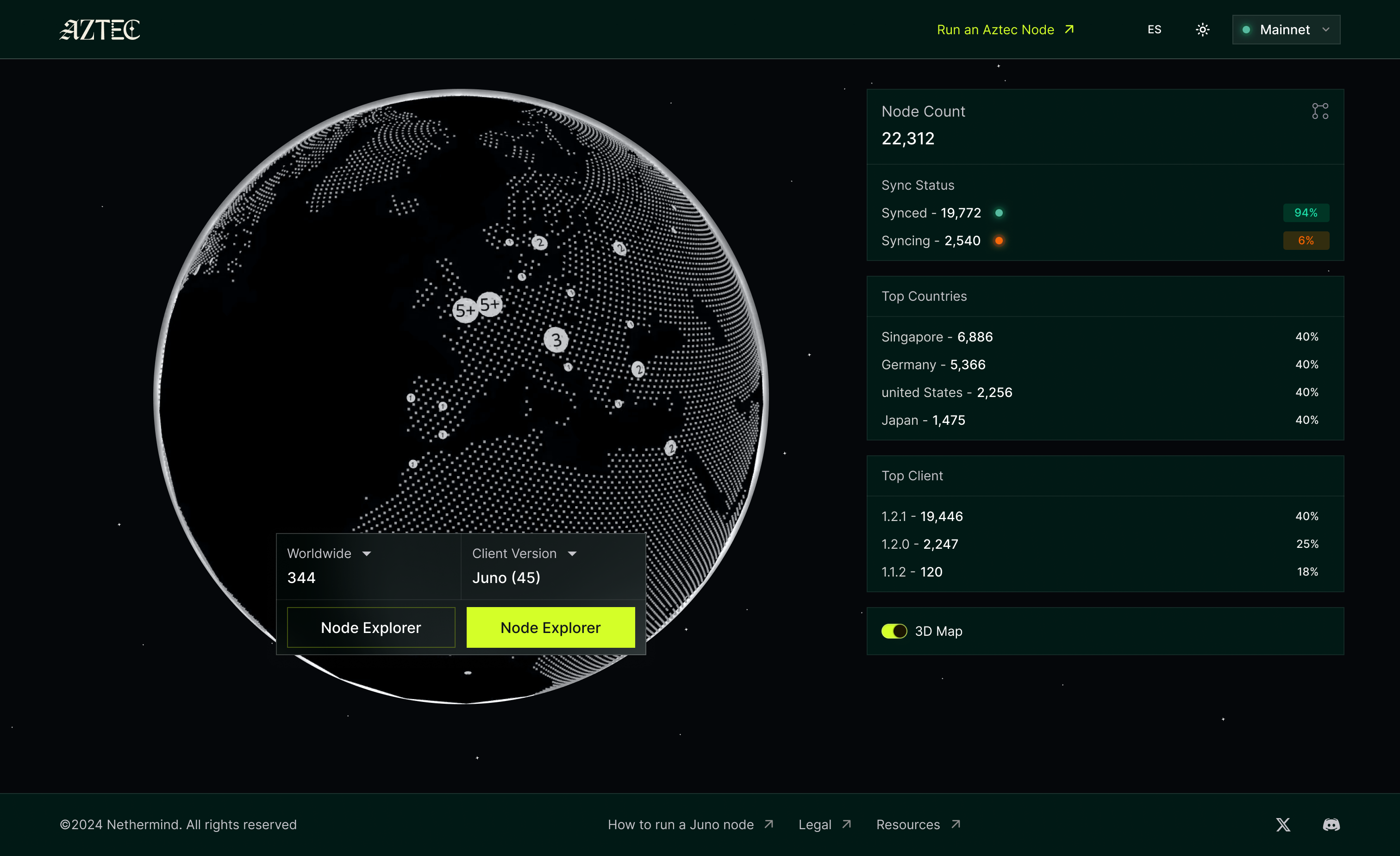
mainnet.aztecnodes.xyzAs Aztec moved toward mainnet, protocol teams, node operators, and governance participants had no shared view of the network they were building on. Aztec Node Explorer was built to fix that — a strategic dashboard that makes network health observable, decentralisation provable, and upgrade decisions data-driven.
The Problem
Making the invisible, visible
P2P networks are often black boxes. As Aztec moved toward mainnet, protocol teams, node operators, and governance participants had no shared view of the network they were building on — no way to verify whether it was healthy, genuinely decentralised, or ready for the hard forks ahead.
The need was concrete: the community required live visibility into network reality to make confident decisions about protocol upgrades. The challenge was that the underlying data — IPs, latency, node types, client versions — is technical, fragmented, and impossible to parse in raw form.
No visibility into health
Was the network propagating blocks fast enough? Were nodes syncing correctly? There was no dashboard to answer these questions.
Upgrade decisions were blind
Hard fork readiness depends on knowing which client versions are live on the network. Without visibility, upgrade coordination was guesswork.
Decentralisation was unproven
AWS-hosted nodes look identical to home-hosted ones in raw data. Proving true decentralisation required a new kind of visualisation.
Design Vision
Three pillars, one dashboard
The Explorer was designed around three strategic objectives drawn from the project roadmap. Each pillar shaped what data to surface, how to visualise it, and who the primary audience was.
Pillar 01
Legitimacy &
Realness
Make the network feel real
A 3D global representation of nodes makes the network tangible. Geographic distribution — AWS data centres vs. home-hosted — turns an abstract claim about decentralisation into a map you can actually see.
Pillar 02
Governance
Support
Inform the upgrade decision
High-level visualisations of Client Versions (Juno, Pathfinder, Deoxys, Papyrus) let the community know at a glance whether the network is ready for a hard fork or major protocol upgrade.
Pillar 03
Health
Monitoring
Translate metrics into meaning
Intuitive "Health Gauges" for Block Propagation Latency, Reorg responsiveness, and sync status — translating raw numbers into indicators anyone can read, not just protocol engineers.
Key Solutions
Three hard problems, three design answers
A — The Semi-Obfuscated Map
How do you show where nodes are without compromising the privacy of node operators? I designed a "semi-obfuscated" interface that groups nodes by region and provider (showing a cluster in an AWS data center, not a precise IP) — balancing public transparency with operator security.
Clusters by region + cloud provider, not exact coordinates
AWS, GCP, Hetzner, TOR, and home-hosted each rendered differently
Decentralisation score derived from the cloud/home ratio
B — Topological Consistency
How do you visualise how well nodes are talking to each other? I proposed a graph view of node connectivity. By tracing which peers recommended others, the UI reveals the "topological consistency" of the network — moving from a static list to a living web of connections.
Graph representation of peer-to-peer recommendations
Novel "topology coefficient" metric for network resilience
Visualises isolated clusters vs. well-connected mesh
C — Non-Partisan Reporting
Juno is a Nethermind product. The design had to avoid looking like internal marketing. I focused the UI on ecosystem-wide metrics — Total Nodes, Client Diversity — and made the Sync Status module comparative across all clients (Juno, Deoxys, Pathfinder, Papyrus) with equal visual weight.
No client is highlighted as primary in the UI hierarchy
Ecosystem metrics (Total Nodes, Client Diversity) lead every view
Sync Status module shows all four clients side by side
Benchmark
Prior art in P2P network visualisation
Before designing the Explorer, I mapped the existing landscape of P2P and blockchain network dashboards. Each reference shaped a specific design decision — from the globe interaction model to the level of data transparency.
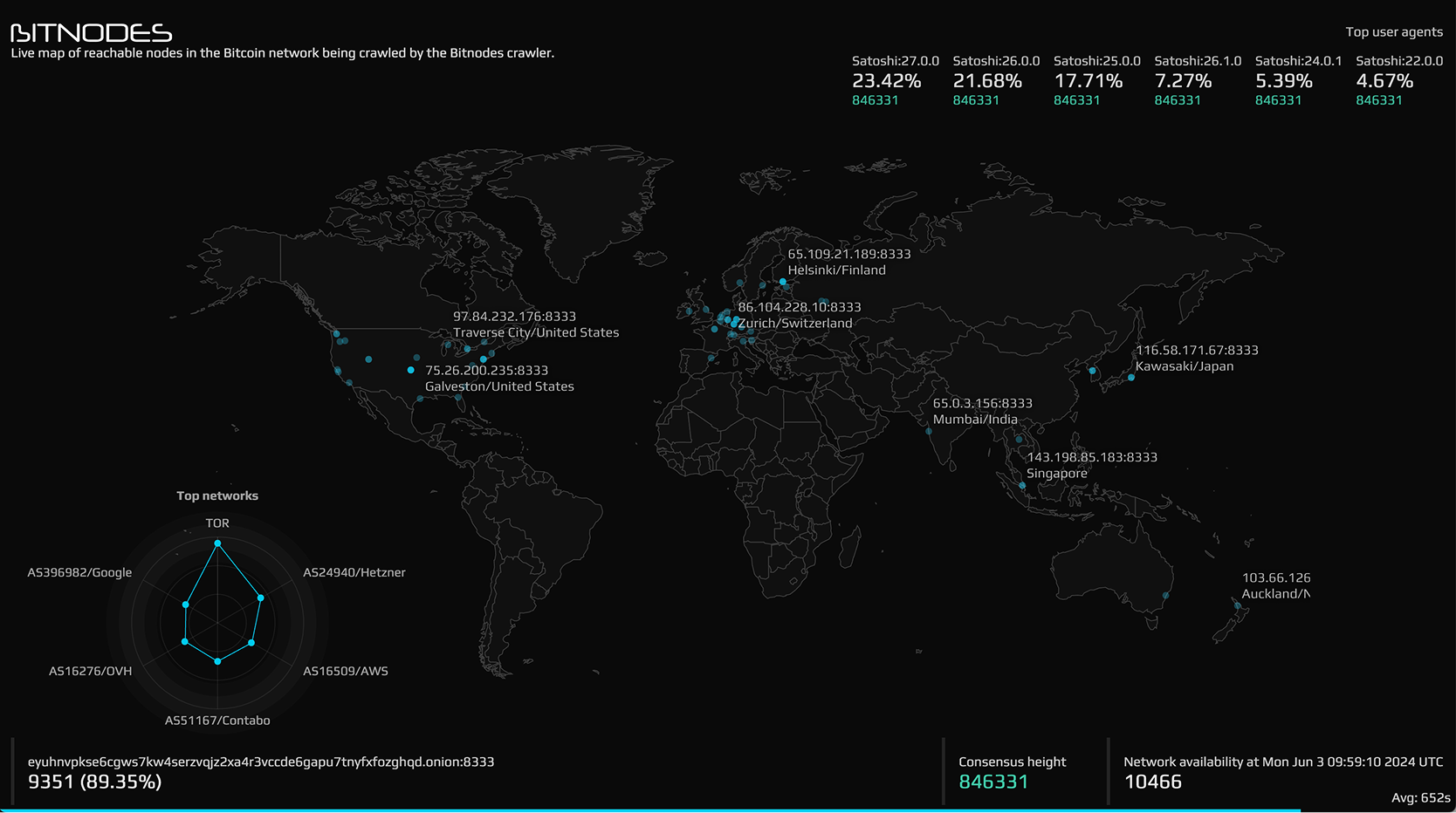
Bitnodes.io
bitnodes.ioLive map of reachable Bitcoin nodes. Sets the standard for geographic node distribution — cyan dots on a dark globe with client version breakdowns in the header. Informed the semi-obfuscated map approach.
Node Map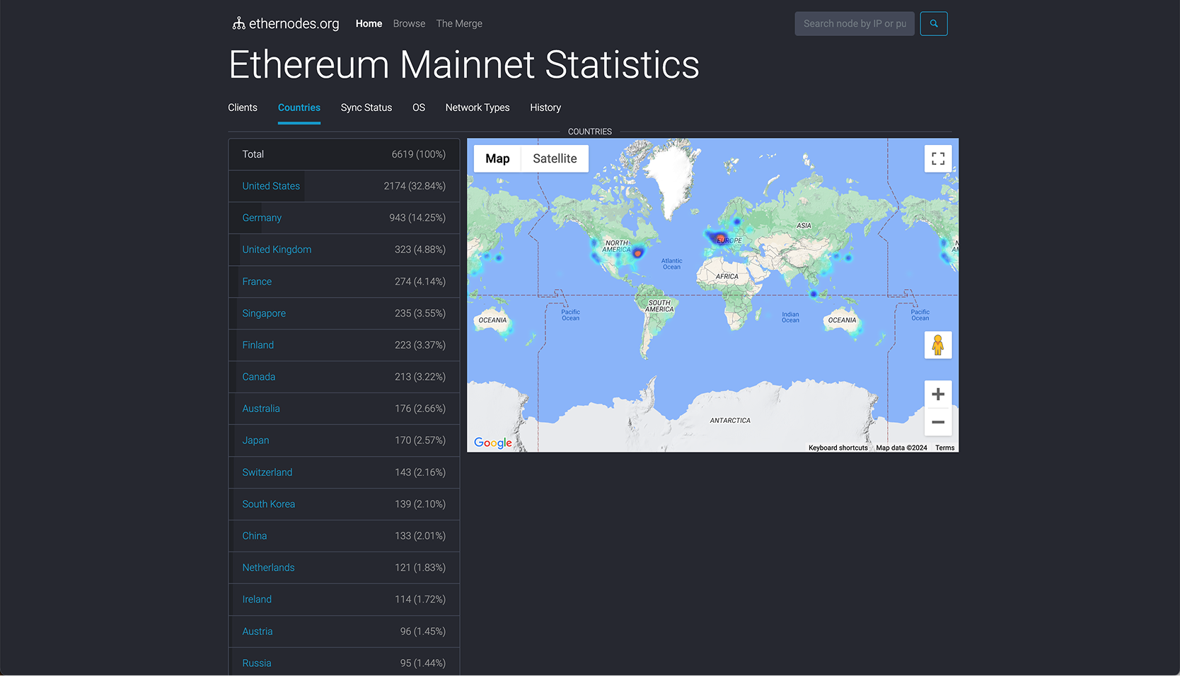
Ethernodes.org
ethernodes.orgEthereum mainnet statistics by country, client type, and OS. The country-by-country breakdown and client diversity tabs directly shaped how the Explorer surfaces upgrade readiness data.
Client Diversity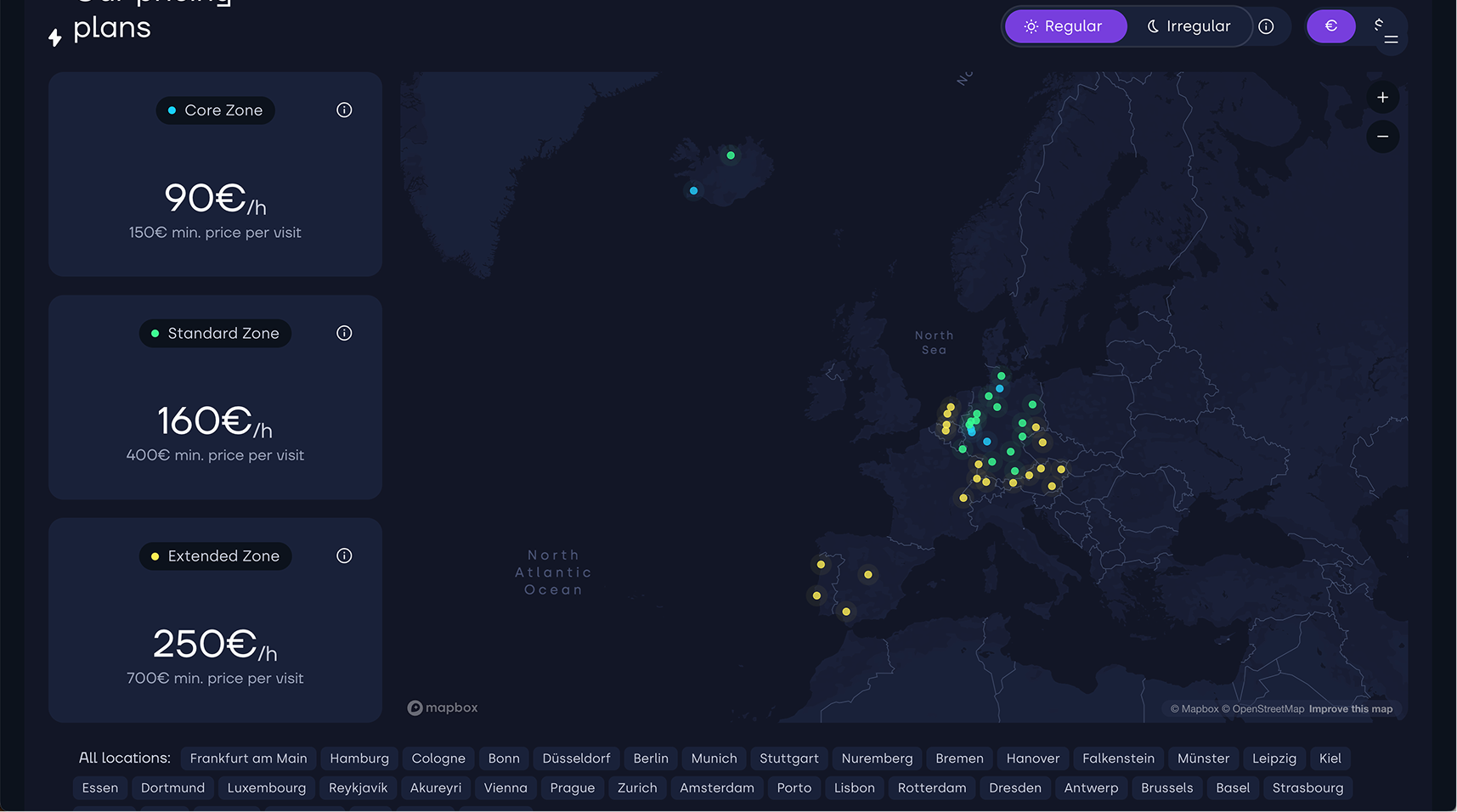
Panascais.net
panascais.netGeographic zone visualisation for sampling plans across Europe. Strong reference for how tiered zones (Core / Standard / Extended) can be rendered on a map without overwhelming the user with raw coordinates.
Zone Mapping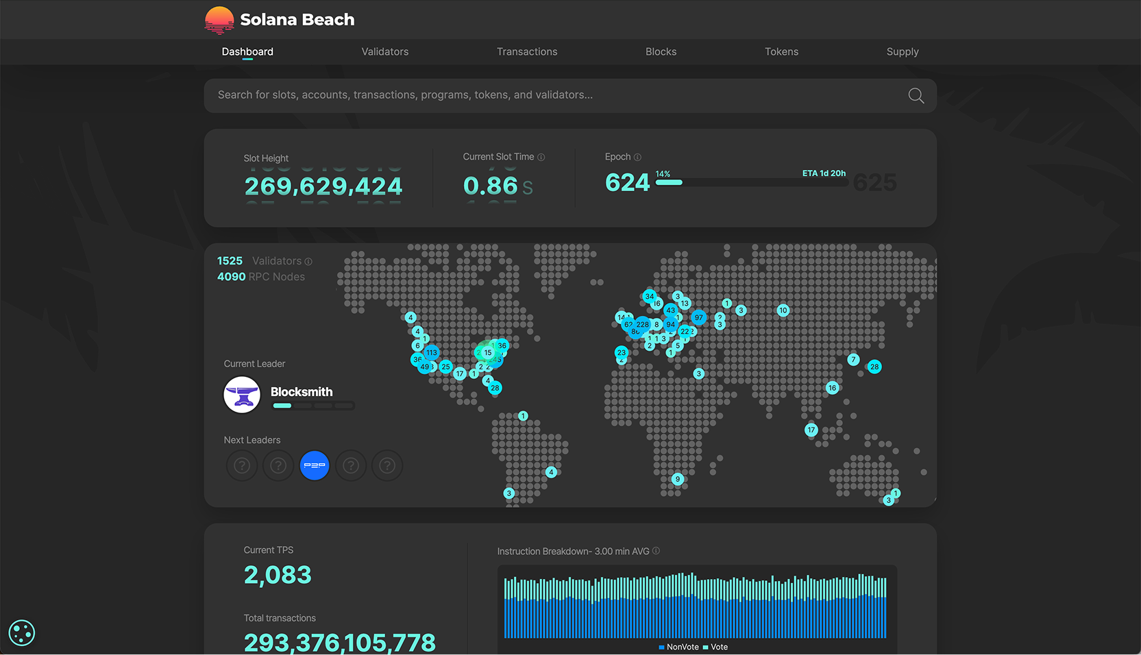
Solana Beach
solanabeach.ioSolana blockchain explorer combining a live validator globe with real-time TPS and epoch data. Key reference for integrating on-chain metrics (slot height, epoch progress) alongside a geographic node map in a single dashboard.
Explorer · Validators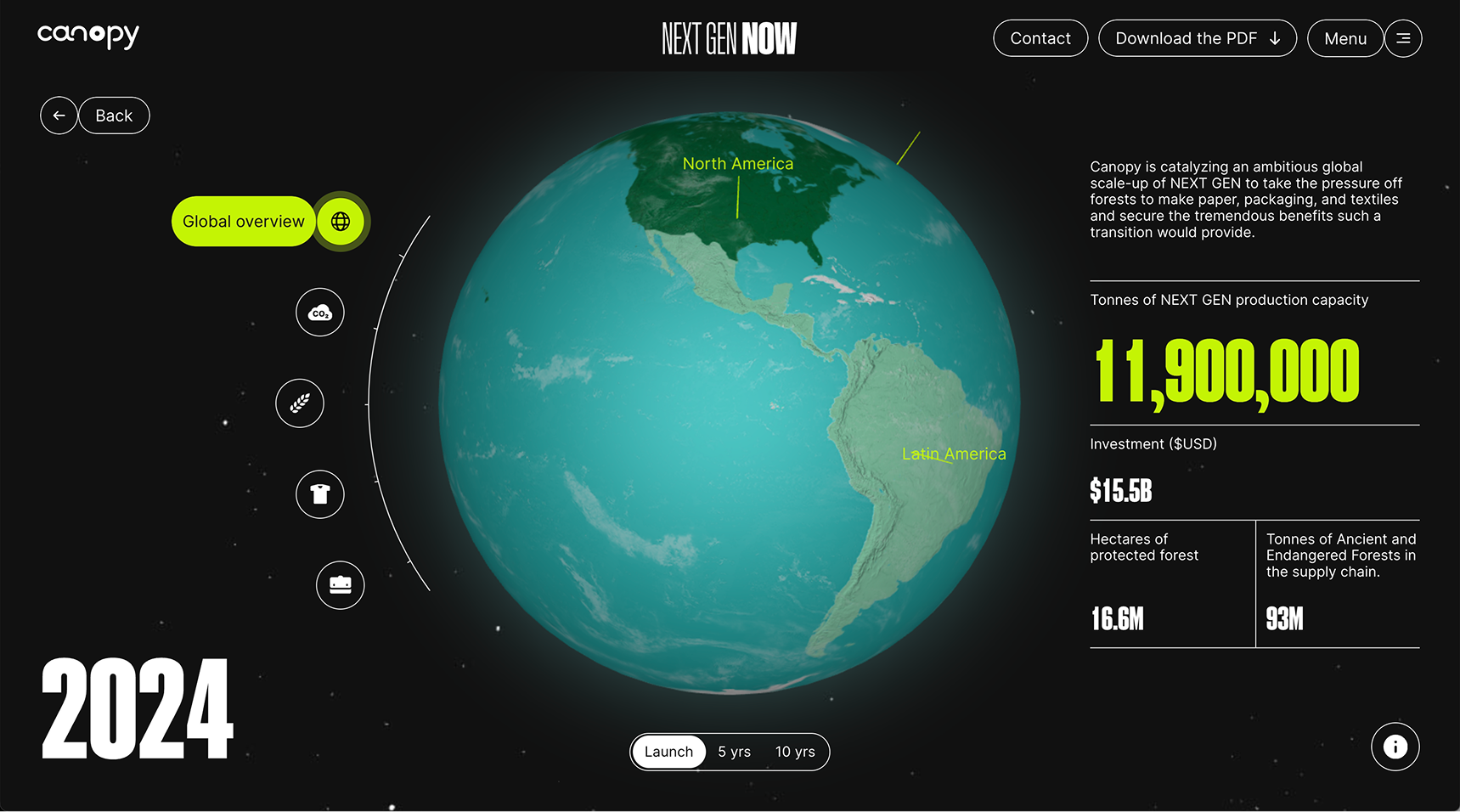
Next Gen Now — Canopy
nextgennow.canopyplanet.orgInteractive 3D globe as primary navigation for environmental impact data. Benchmark for using the globe not just as a backdrop but as the main interaction surface — time-scrubbing through years on a rotating earth.
3D Globe · Storytelling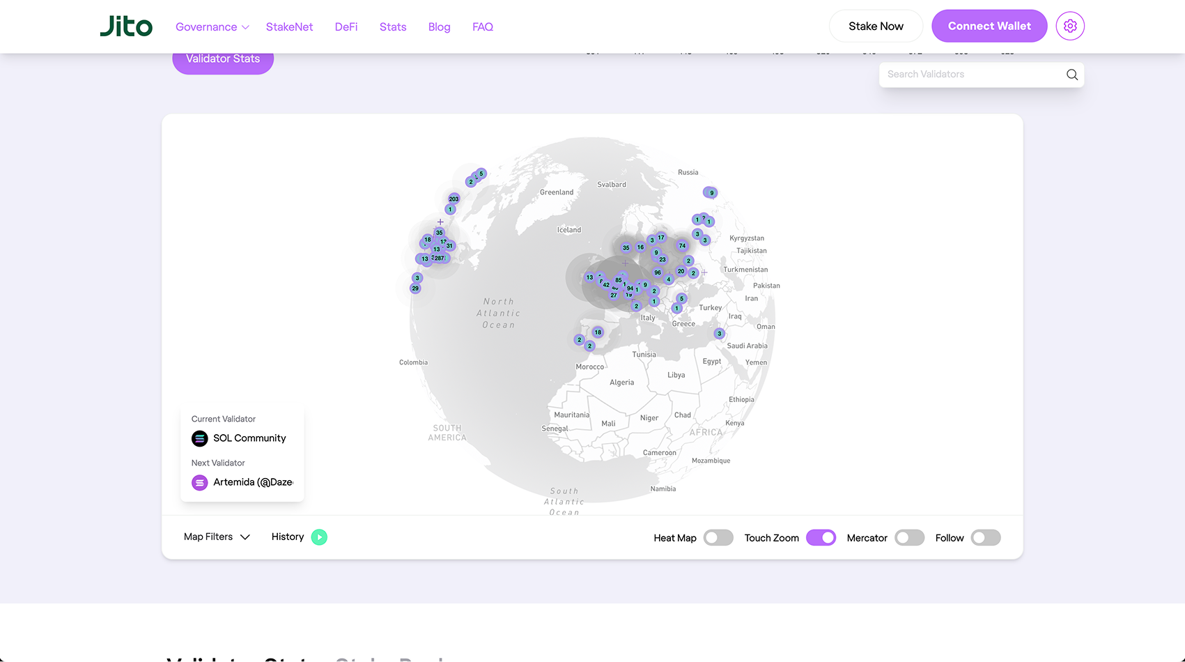
Jito Network
jito.networkSolana staking and validator stats with a 3D globe showing active validator positions. Informs how to pair a validator detail panel with live globe rotation — especially the current/next leader pattern relevant to block propagation.
Staking · Validator Stats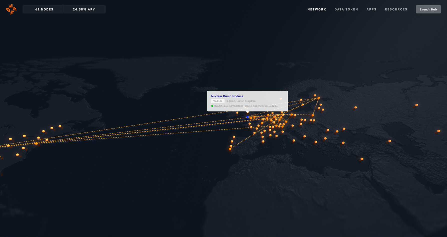
Streamr Network
streamr.networkDecentralised data network visualised as a dark globe with live orange connection lines between nodes. The strongest reference for rendering peer-to-peer data flow — connection lines as first-class visual elements, not overlays.
P2P Flow · Data NetworkLo-fi
Wireframes — three iterations
Before committing to visual direction, I explored the core layout in greyscale wireframes. The three rounds tested how to balance the map, the stats panel, and the filter bar — progressively moving from a flat rectangular map to a globe, and expanding the sidebar data model with each pass.
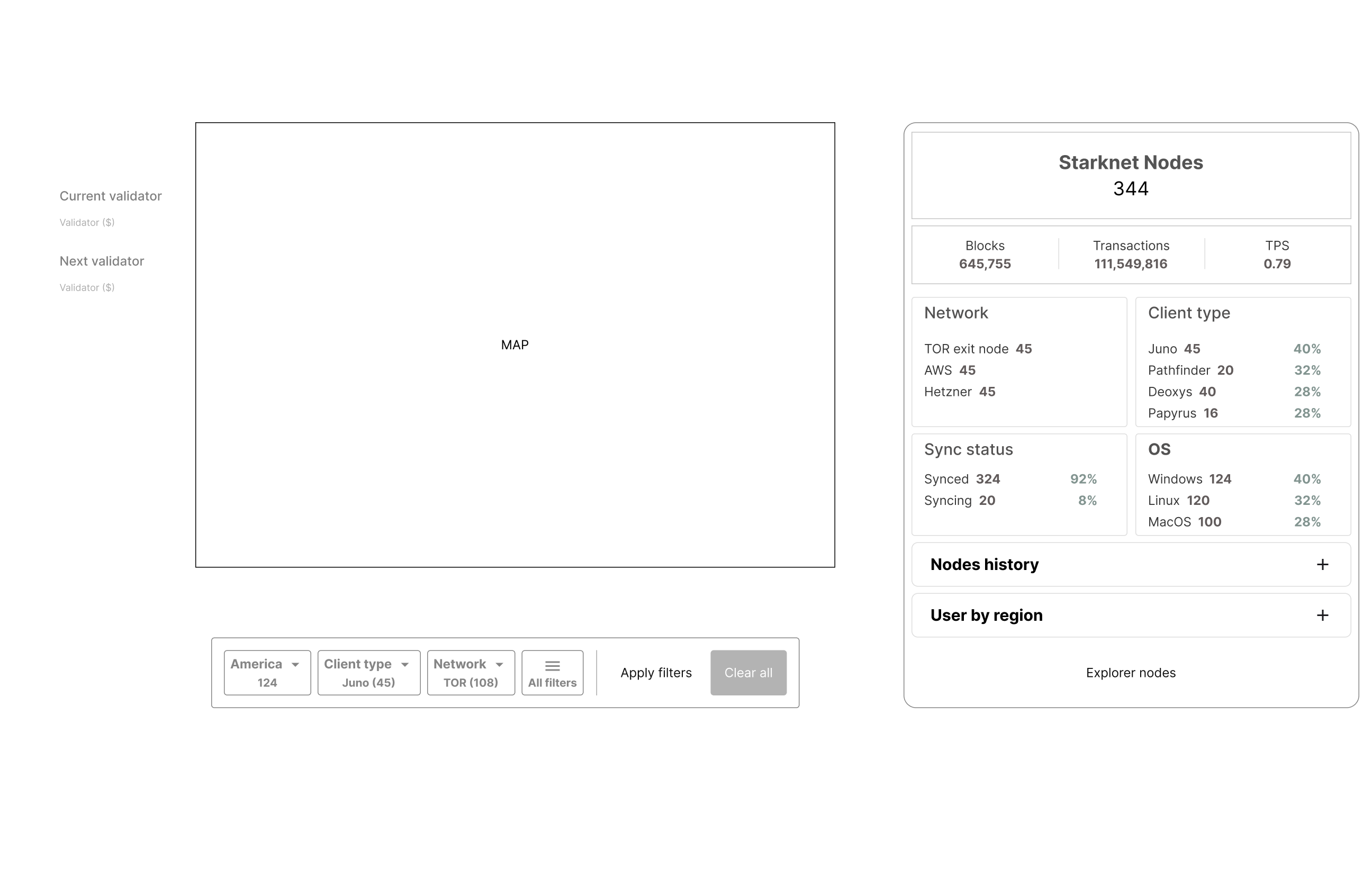
Flat rectangular map with a structured stats panel (Blocks, TPS, Client type, Sync status) and a filter bar anchored to the bottom. Established the two-column split and the core data categories.
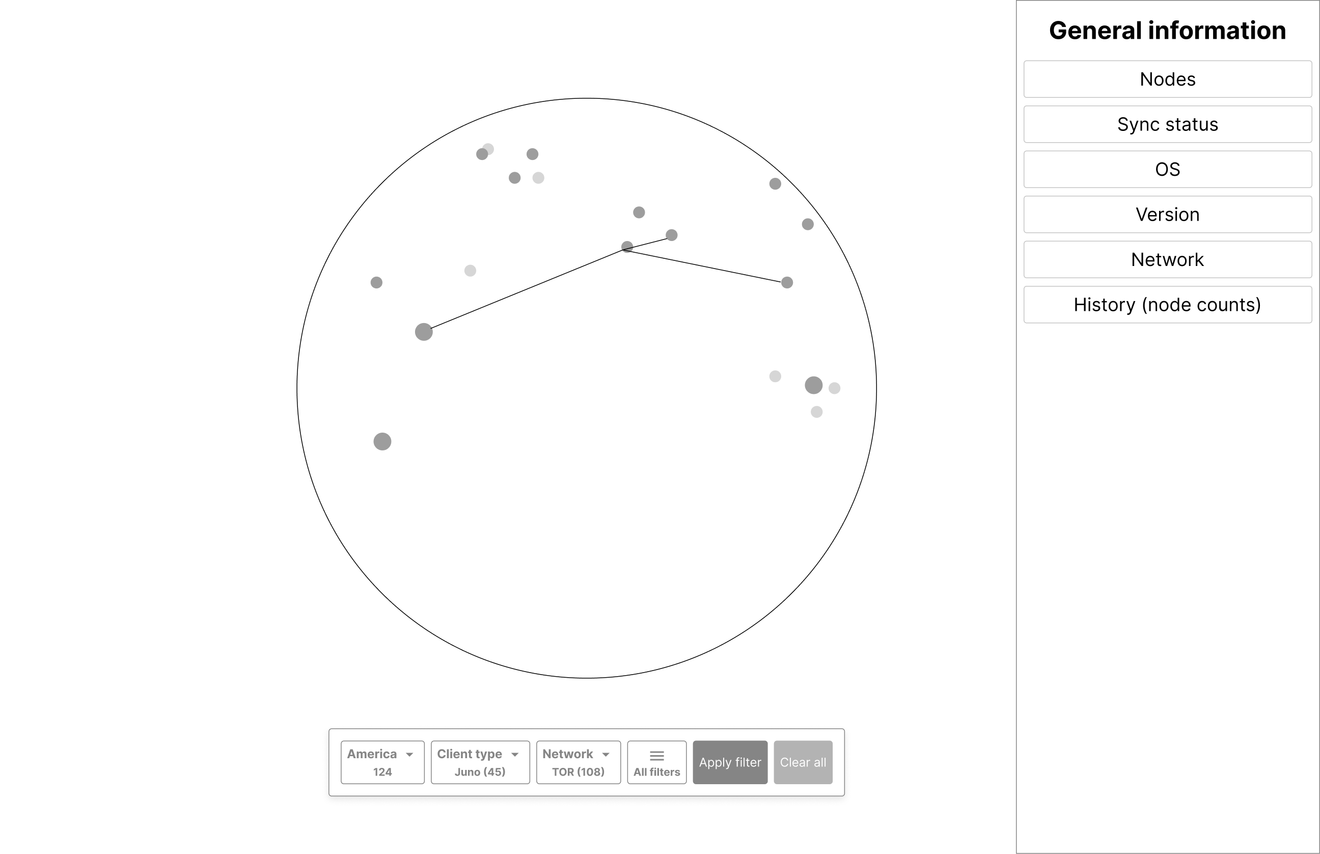
Switched the map to a globe with node clusters and peer-connection lines. The sidebar became a flat index of data categories (Nodes, Sync status, OS, Version, Network, History) — testing what information architecture the panel needed to hold.
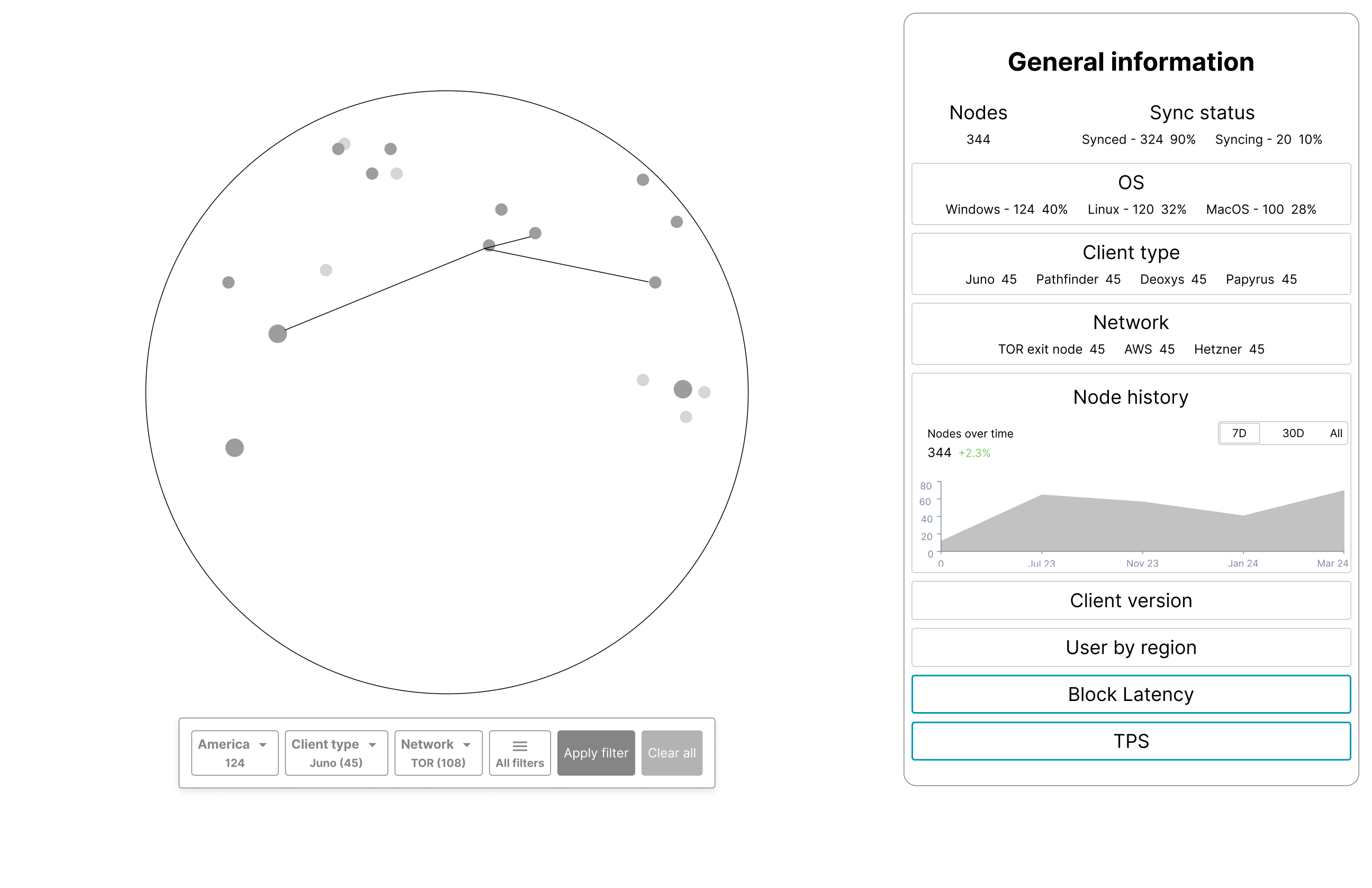
Globe retained, sidebar fully expanded. Added the Nodes over time chart with a 7D / 30D / All toggle, inline breakdowns for OS and Client type, and new modules for Block Latency and TPS — establishing the final scope of the dashboard.
Hi-fi
Desktop — final designs
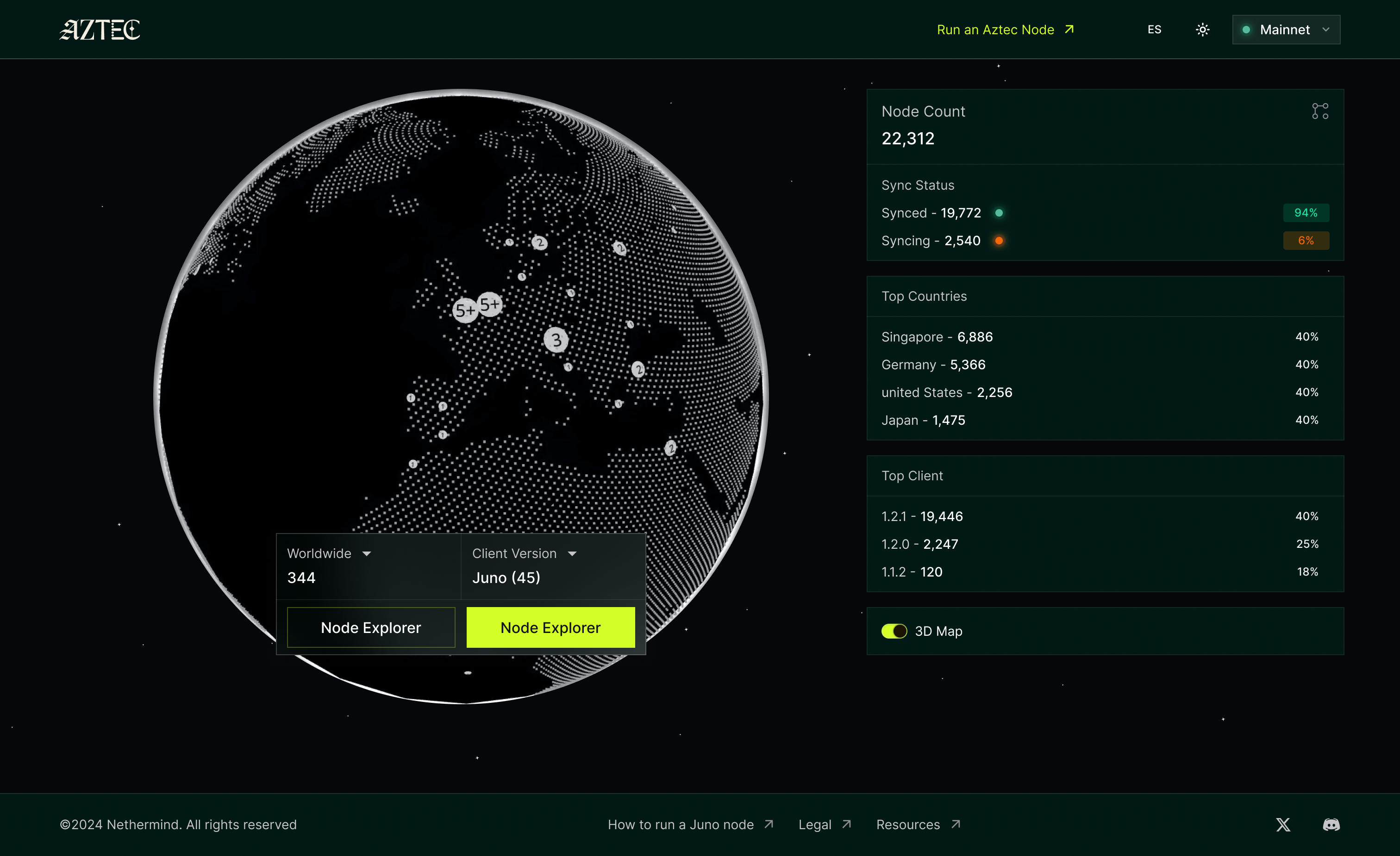
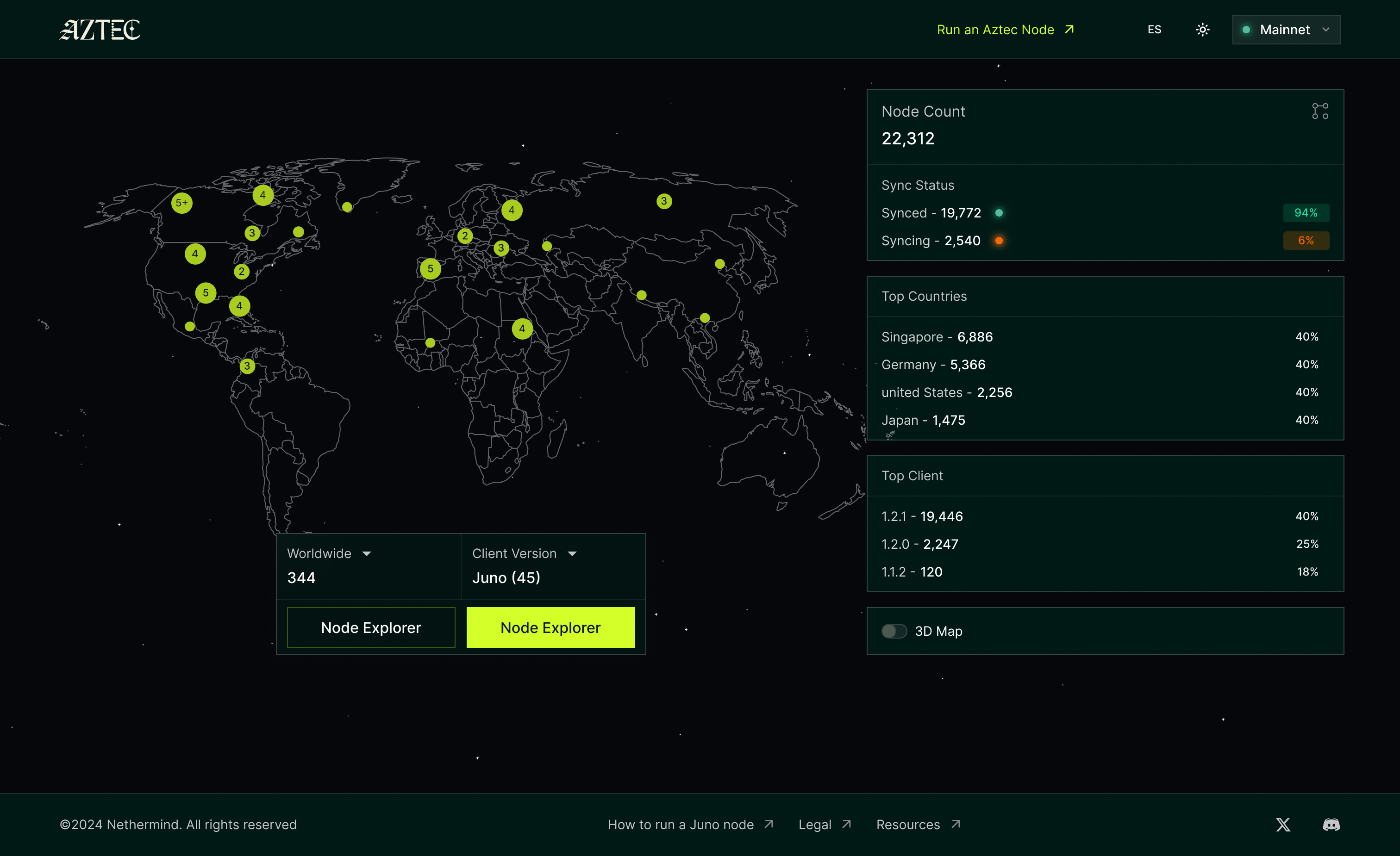
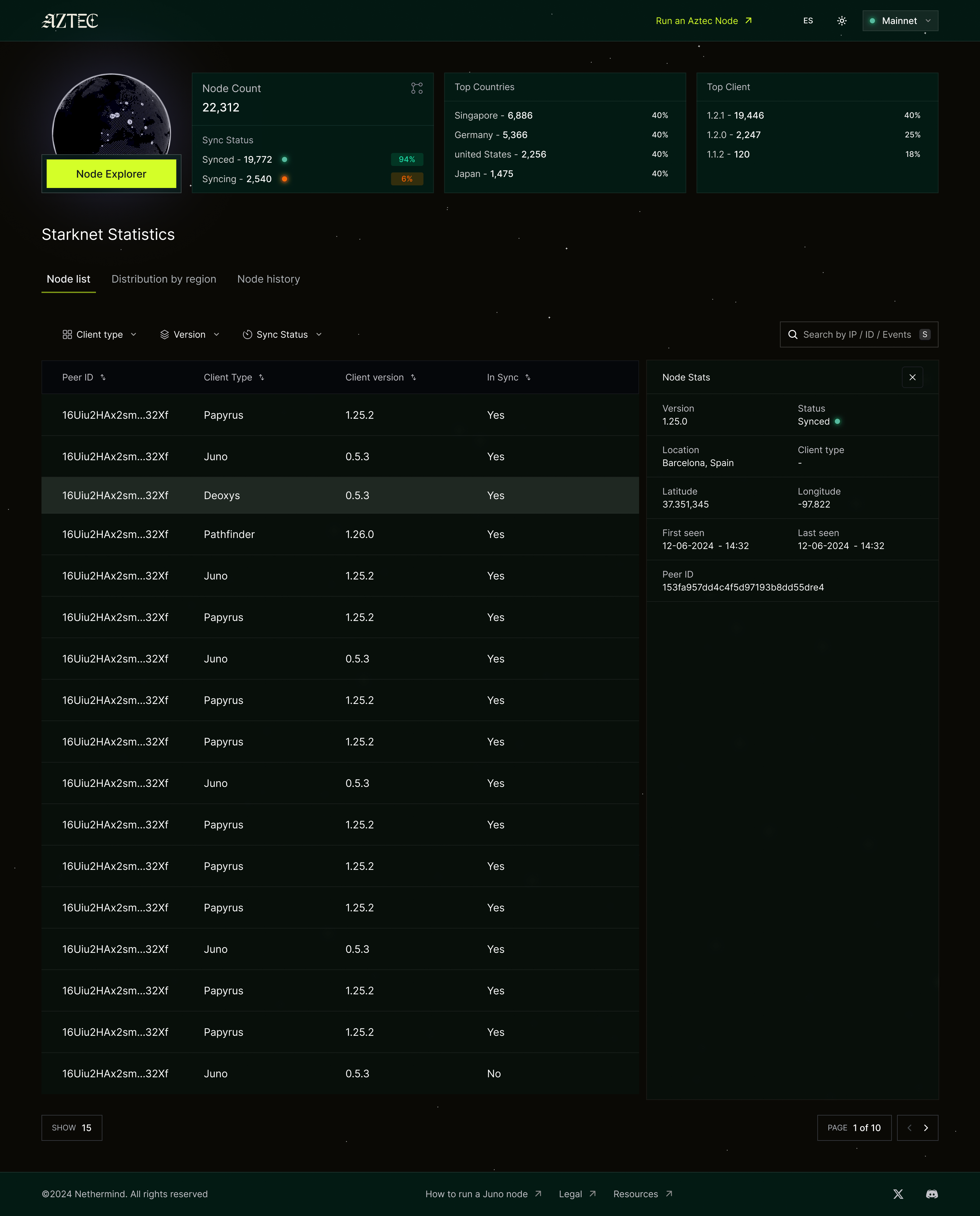
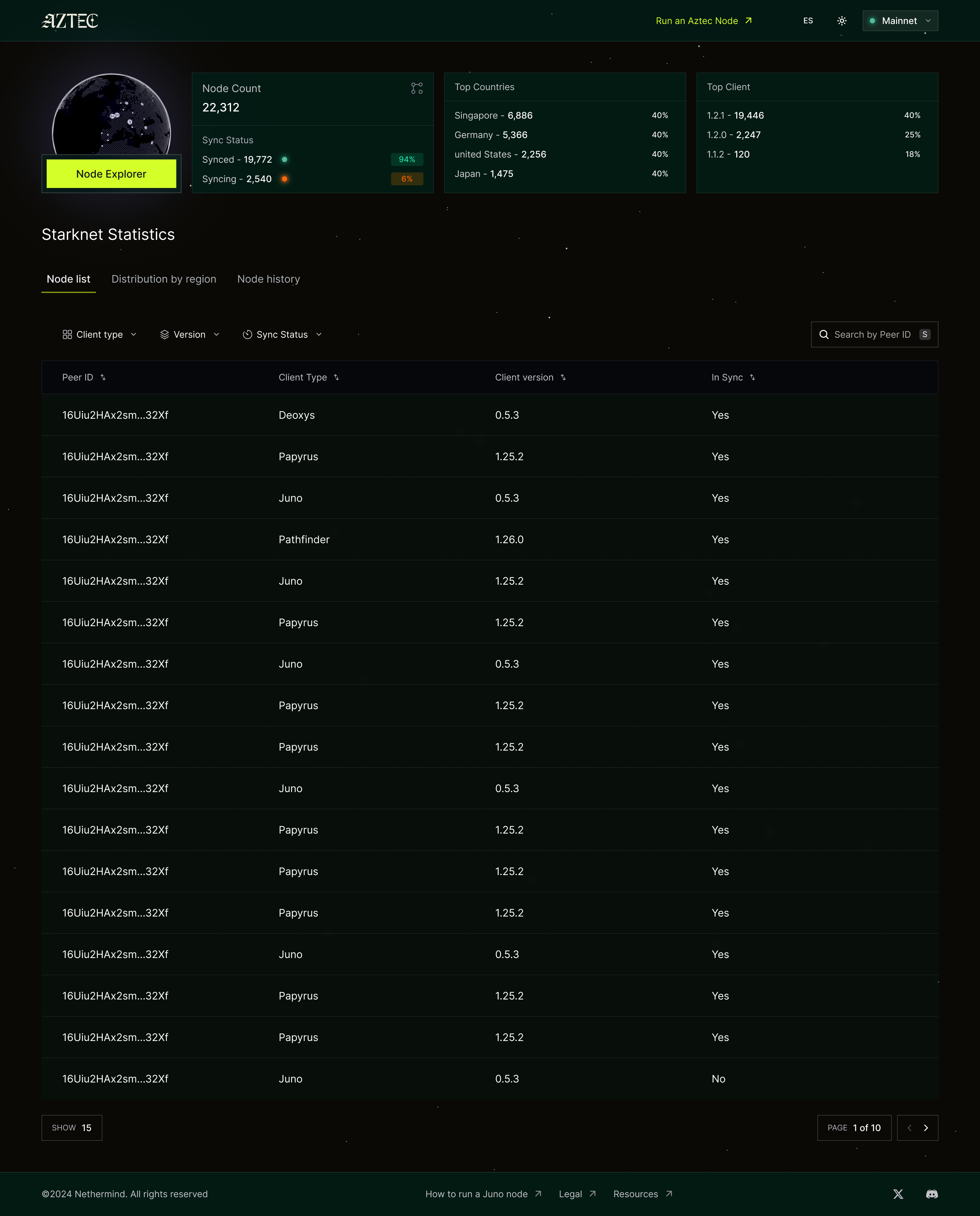
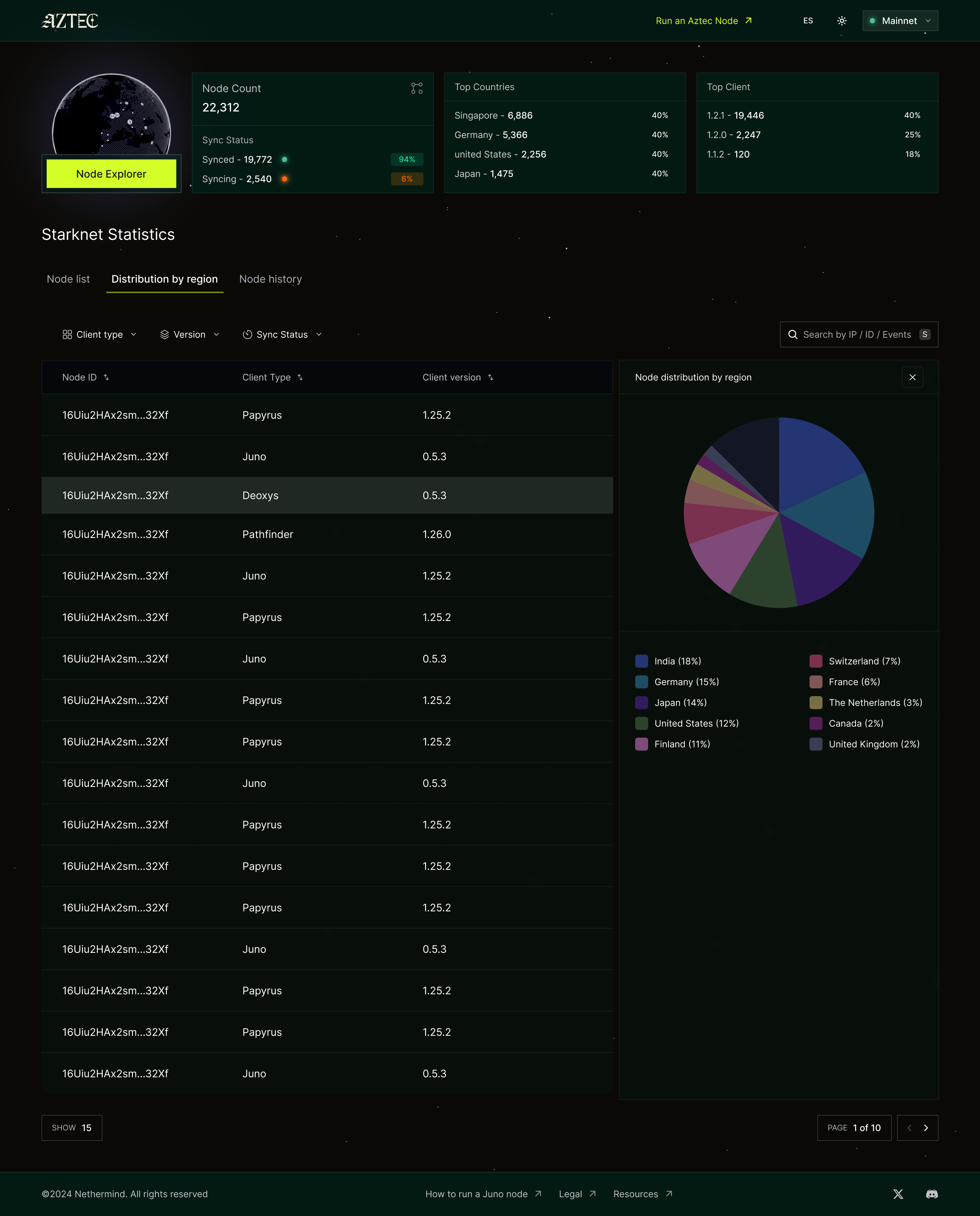
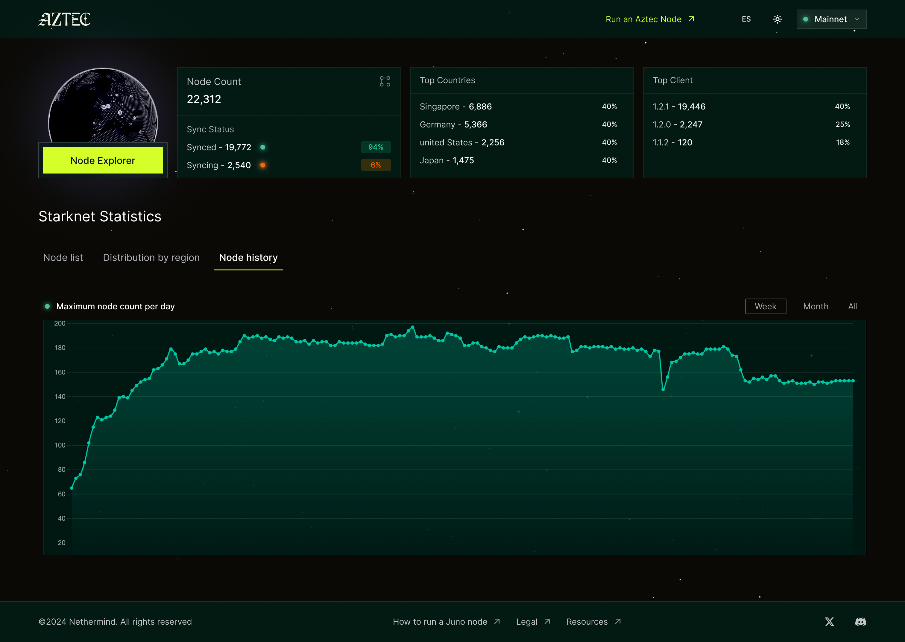
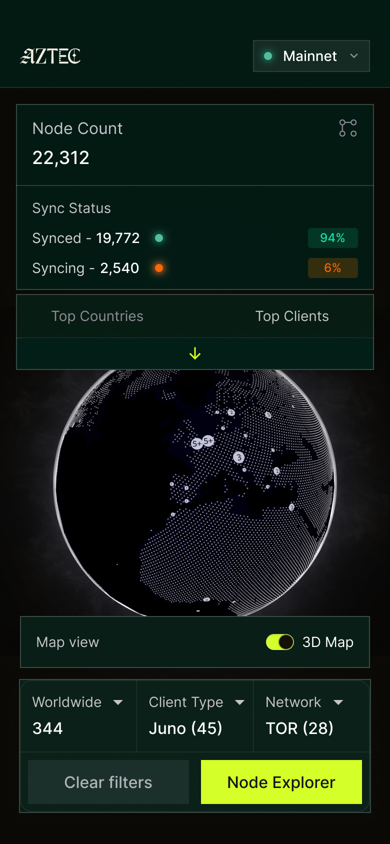
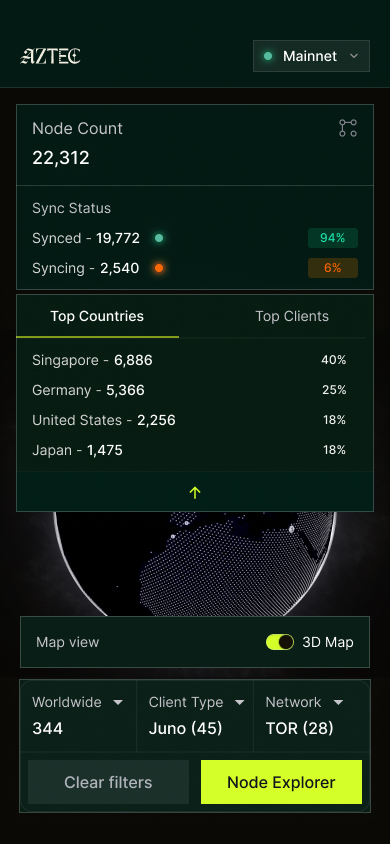
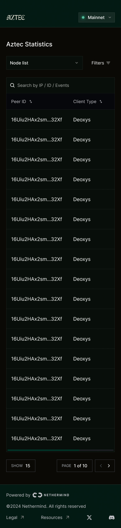
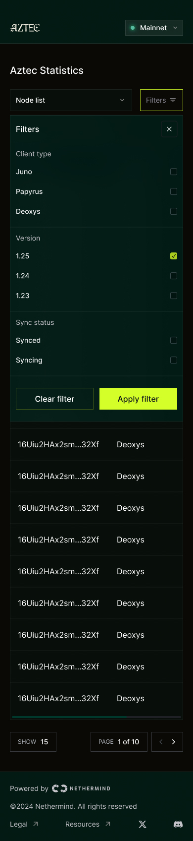
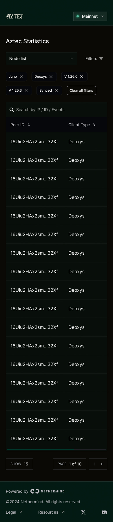
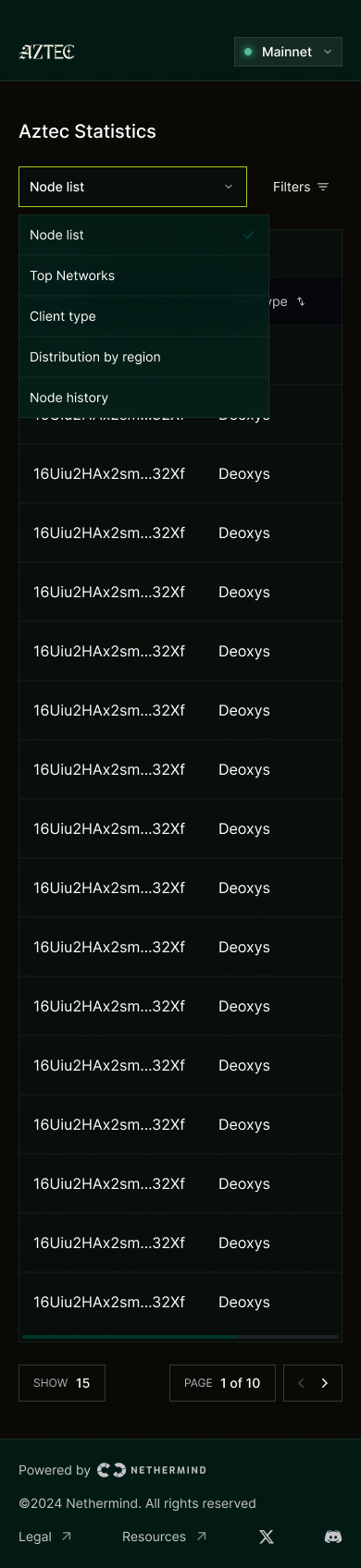
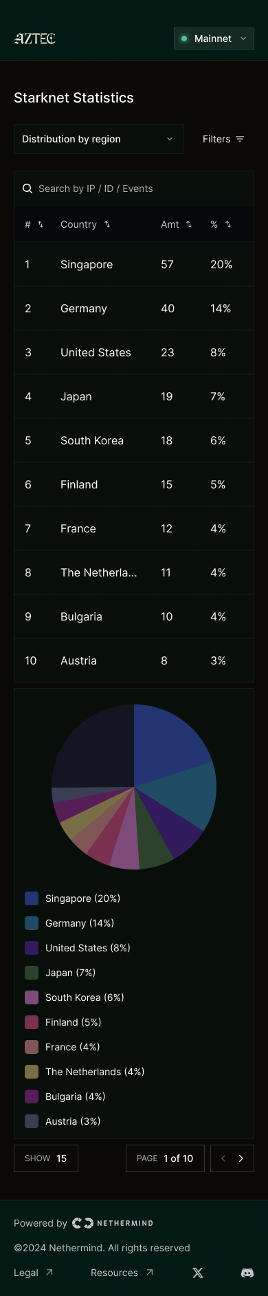
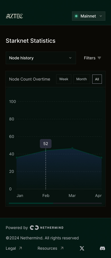
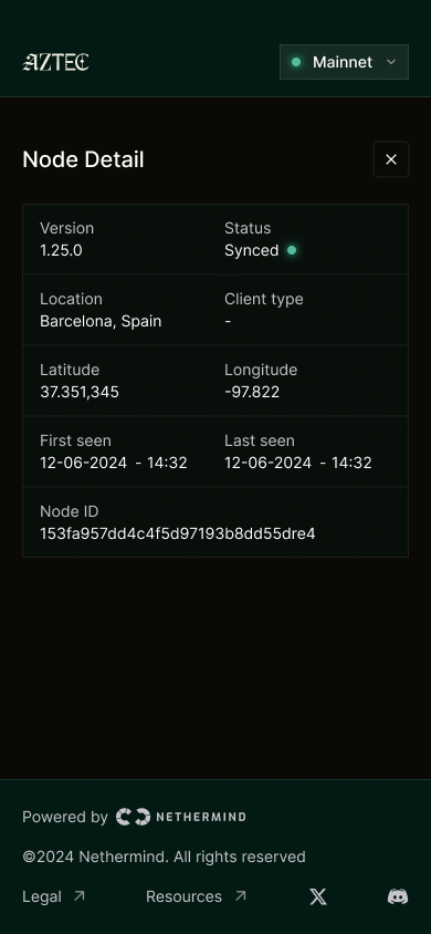
The high-fidelity screens applied the Aztec design system to the validated wireframe structure. The result is a fully dark-mode dashboard with a 3D/2D globe toggle, a live stats sidebar, and three explorer views: Node list, Distribution by region, and Node history.
Mobile
Architecture
Two node types, one network
The Starknet P2P layer (built on libp2p) uses two distinct node roles. Every metric in the Explorer maps back to one of them — understanding this distinction was foundational to every design decision.
Type 01
Boot Nodes
Entry points that sync from the feeder gateway and gossip new blocks to all peers. Every normal node needs at least one boot node to join the network.
Type 02
Normal Nodes
Full nodes that sync exclusively via P2P. They use Kademlia DHT for peer discovery, pull block data from peers, and contribute to the network once synced.
How a block reaches every node
Boot node picks up new block
Sequencer publishes via feeder gateway → boot nodes pick it up immediately.
Block gossiped across the network
Boot nodes gossip to all peers. Without consensus, gossip is the sole propagation path.
Normal nodes discover and sync
Via Kademlia DHT, nodes find peers, negotiate a target height, and pull block data.
Node reaches tip and contributes
Once at chain tip, it listens for gossip and serves data to its own peers.
Design System
Aztec colour tokens
The Aztec DS is built on nine named palettes. Each scale runs from a light tint to a deep dark, giving components a consistent range for backgrounds, borders, text, and interactive states.
Parchment
Chartreuse Brand
Orchid Brand
Malachite
Aqua
Vermillion
Lapis
Aubergine
Oxblood
Results & Impact
From CLI tool to strategic dashboard
The design moved the project from a "dev-only CLI" to a Strategic Dashboard for the Starknet community — a tool that indicates network health, coordinates upgrade decisions, and serves as a live proof of decentralisation.
Network visibility
Real-time global view of every Aztec node — version, geography, and sync status.
Upgrade readiness
Version split across v4.1.x and v4.2.x shows the network is actively upgrading — visible at a glance.
Geographic spread
Nodes across 4 continents — US, Europe, Singapore, Australia — proving real decentralisation, not just cloud concentration.
What we learned
A PoC creates a false baseline
The initial implementation included spec hacks that gave a misleading sense of effort. Timelines were set against that baseline — and consistently missed. Any production-grade P2P sync requires a realistic estimate of cross-team coordination overhead.
Spec alignment is the real bottleneck
Seven open PRs across client teams created continuous overhead. Moving ahead of unmerged PRs meant staying in sync with live debates — and sometimes intentionally dropping unit tests to keep pace, accruing debt.
Design questions emerge late in protocol work
Block batching, blacklisting, StateDiff structure — these only surfaced once initial sync was running. They aren't avoidable, but building in buffer for them is essential. The StateDiff problem alone required evaluating three structural approaches before settling on a pragmatic short-term solution.